I am very excited to share our latest and greatest design project, Building A Dream…
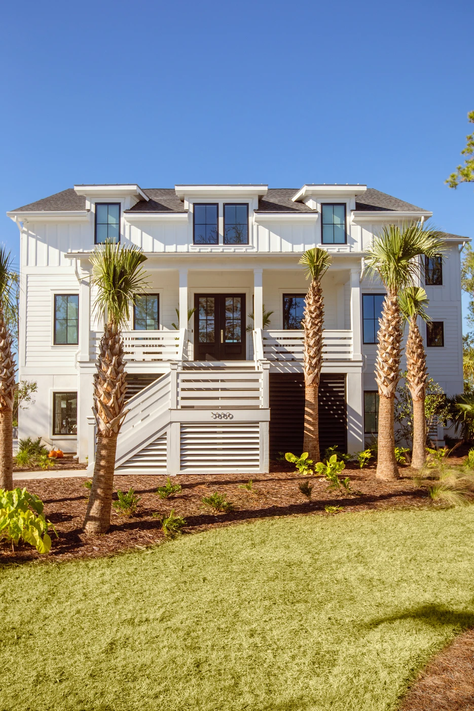
Image Details: Front of the Home
This is our second time working with this sweet client we were eager to help design and build her dream home from the ground up.
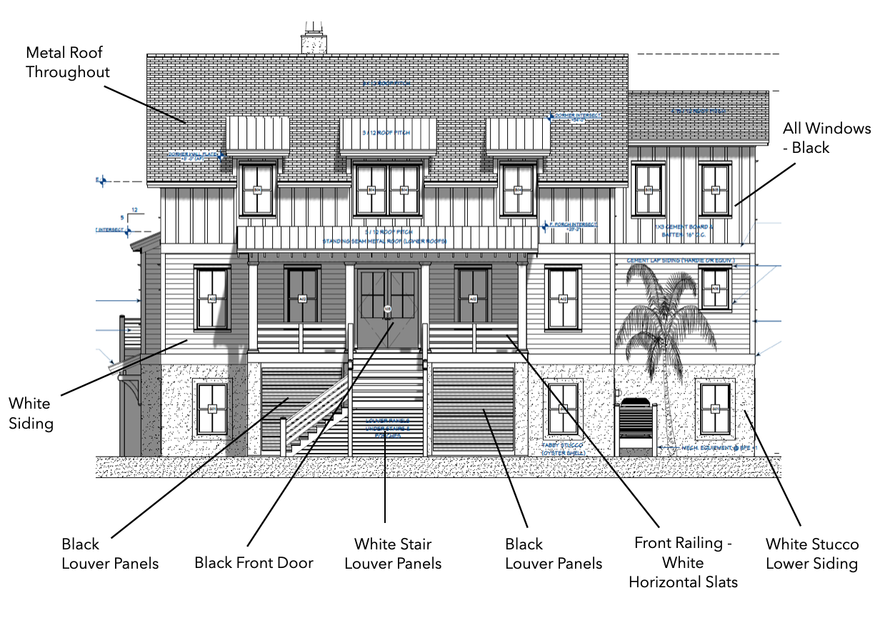
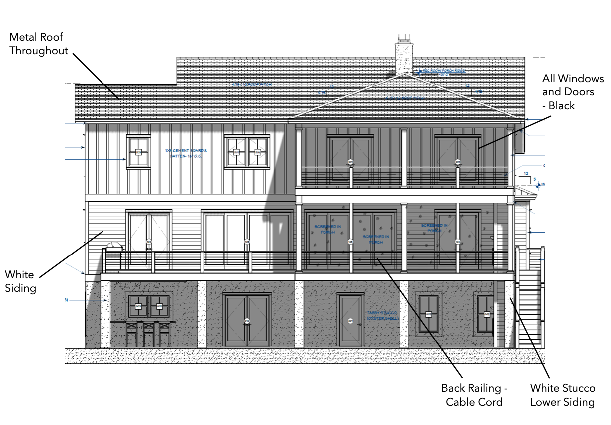
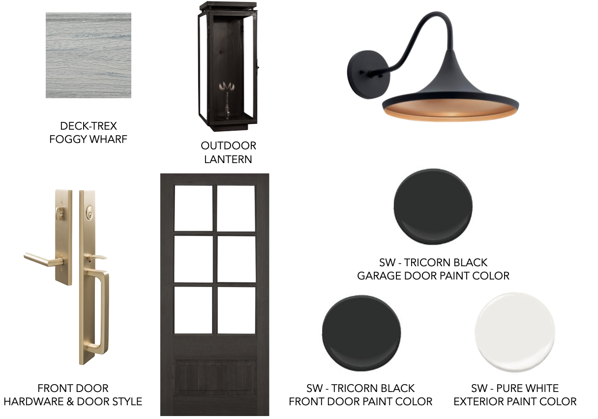
Image Details: Construction + Exterior Selection Plans
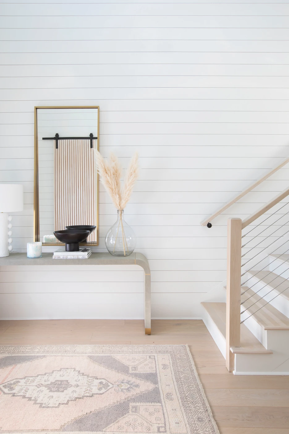
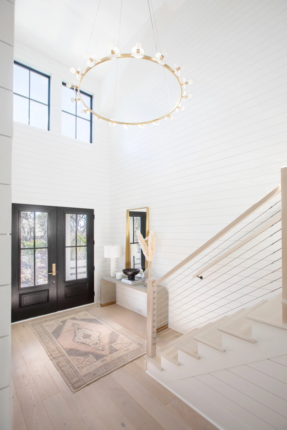
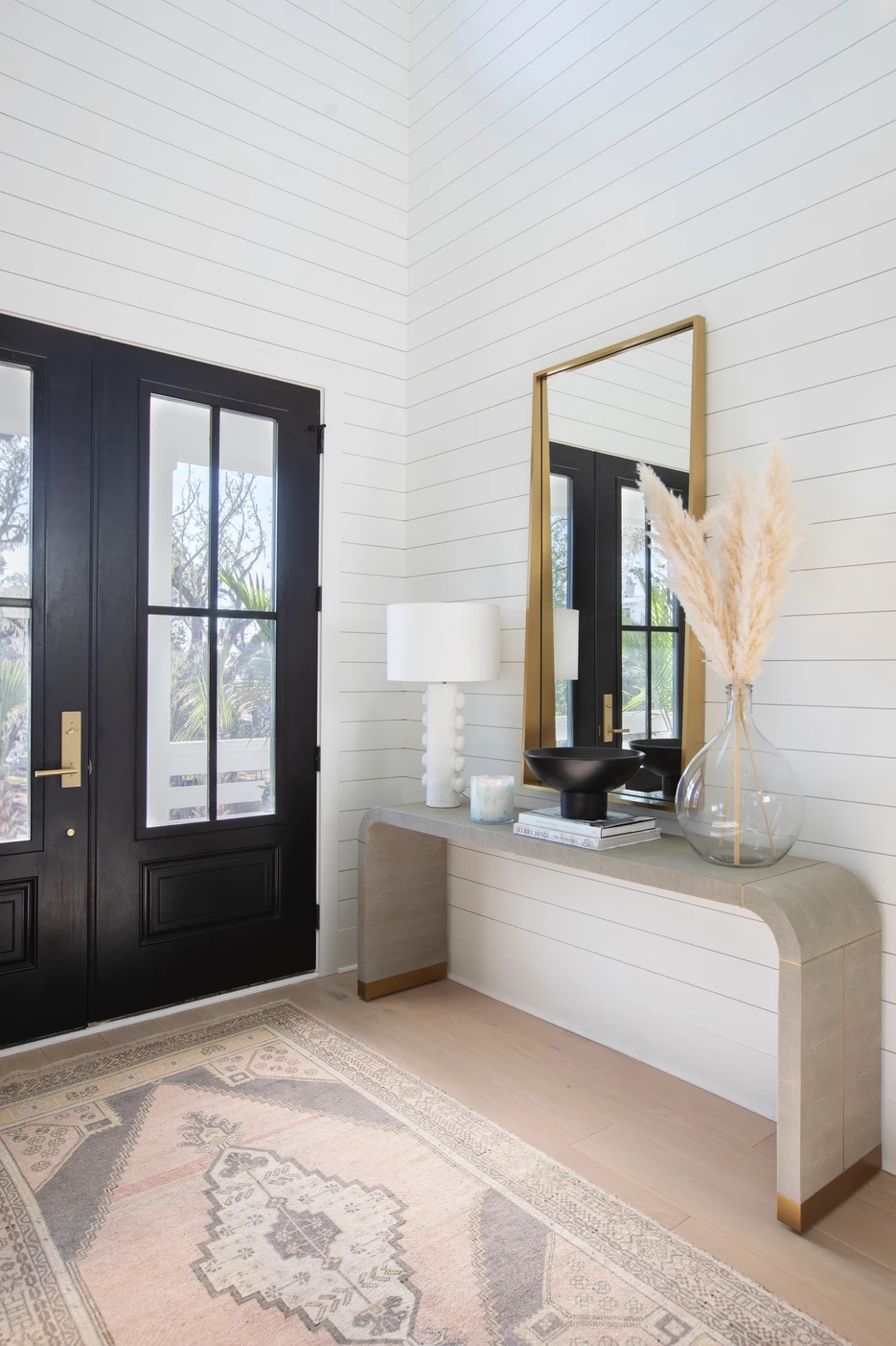
The first impression of a home we wanted to create a moment! Painting the walls Pure White by Sherwin Williams all the way up created a light, bright, and inviting space. Incorporating a large Vintage Turkish rug to bring in soft color and character was next. People often forget these rugs are over 100 years old- they are extremely durable. Perfect for high-traffic areas like this entryway. Finally, bringing in a console for extra storage, installing a pretty chandelier, and accessorizing made this space feel welcoming
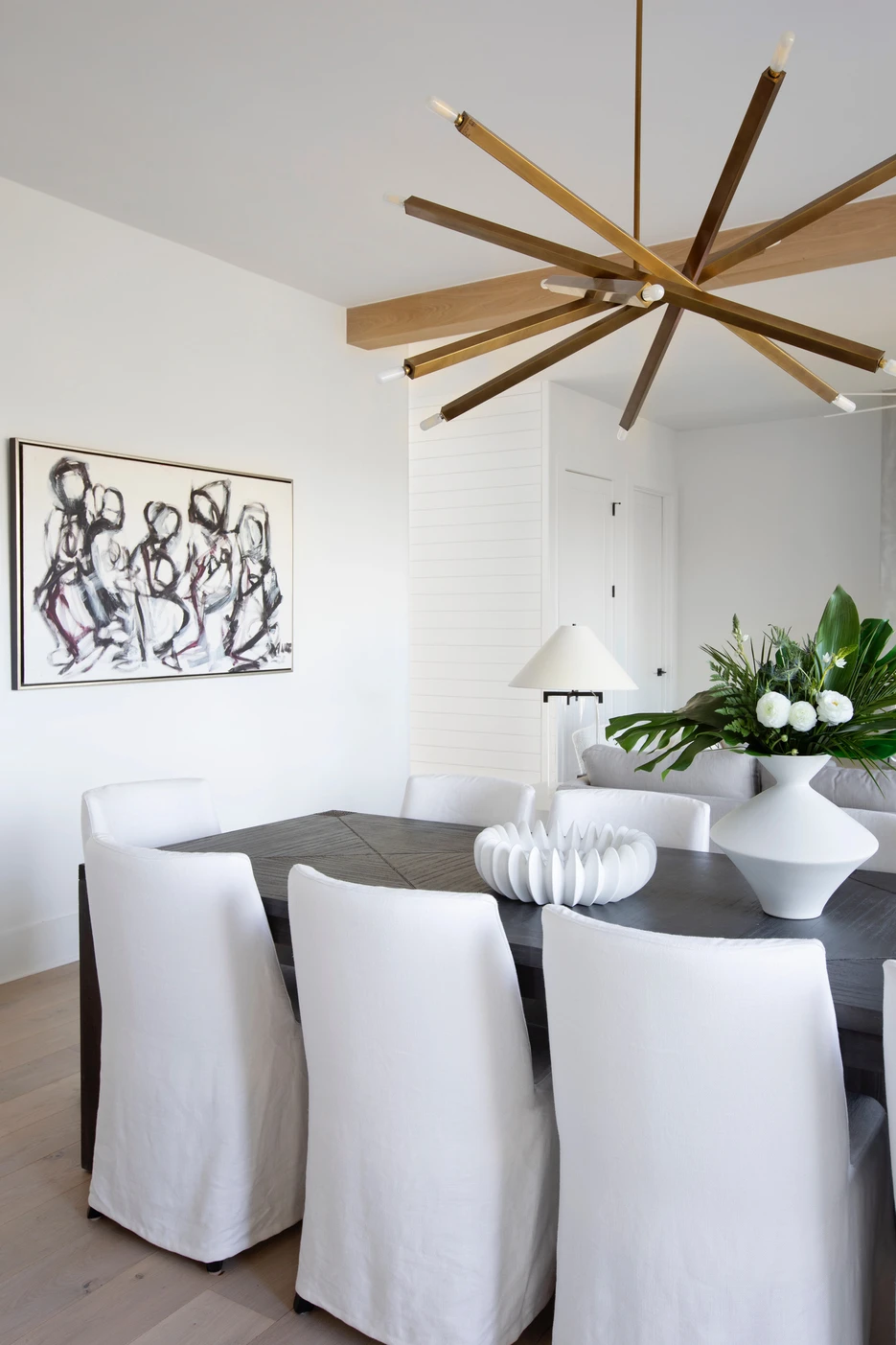
We rarely see separate Dining Rooms in homes these days. Now with open-concept living- you have your kitchen, living, and dining all in one space. Your dining table is now the place you eat dinner every night and the table you are hosting holidays. It needs to be durable! This dining table was a happy accident! Originally, the table chosen for this project was a pretty White Oak. Due to COVID and other delays, we ended up with this Dark Ebony wood finish table. Sometimes when things go wrong it ends up being right- what we call, “a happy accident”.
This table needed to be large and seat up to ten people. Because the client wanted the table to accommodate a large group, we styled the space leaving the leaf in and surrounding the table with ten pretty slipcover chairs. I love the dark wood and light fabric contrast. On the chairs, we used a performance fabric. These are essential to use for a client with children! White chairs can be intimidating- using a performance fabric eliminates all the stress. If a spill or accident happens, throw the covers in the wash.
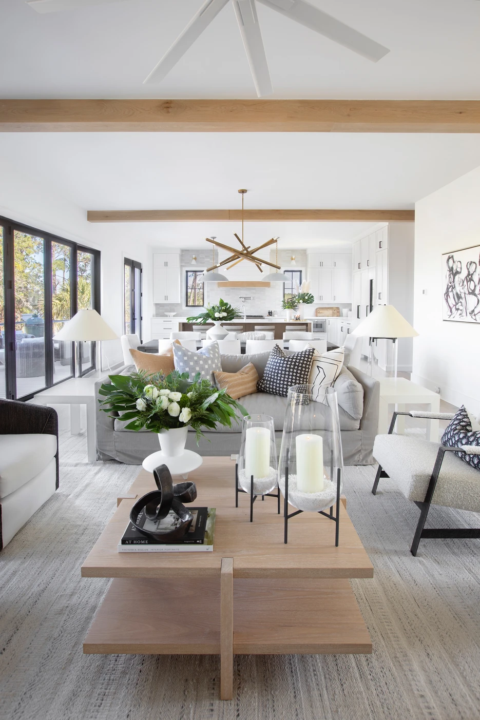
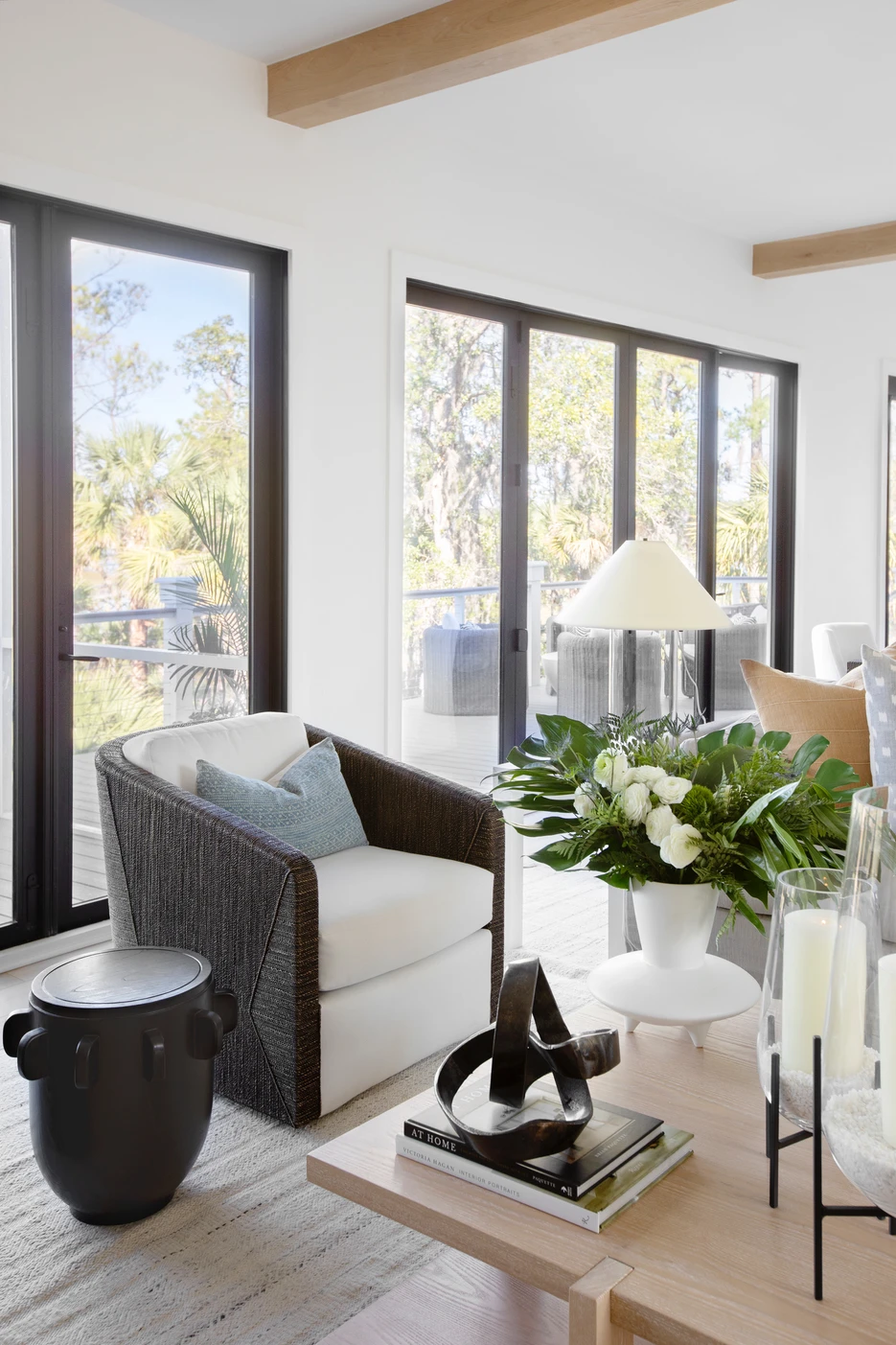
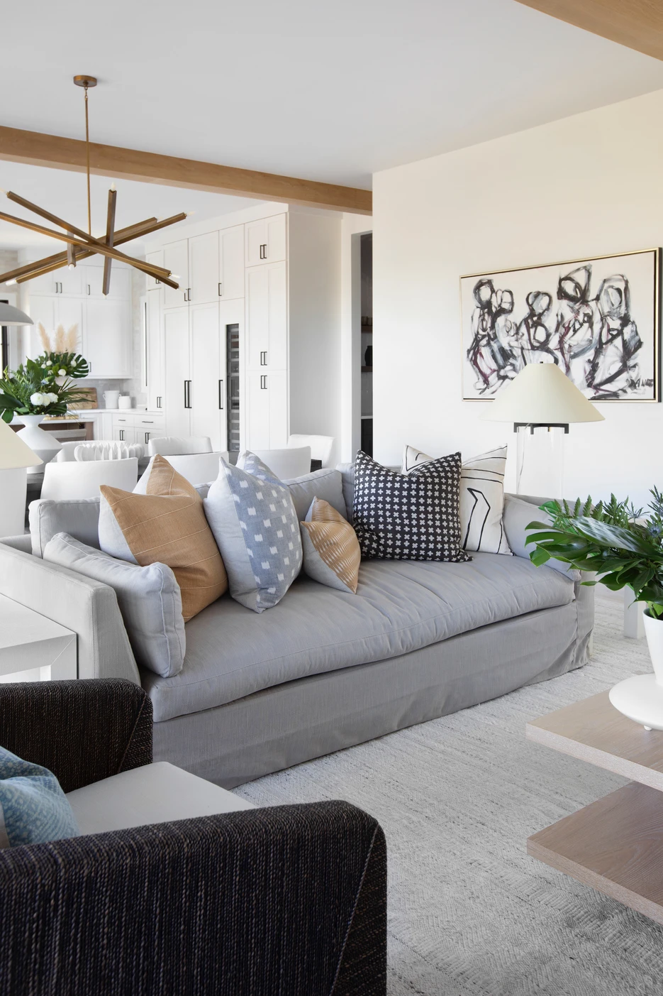
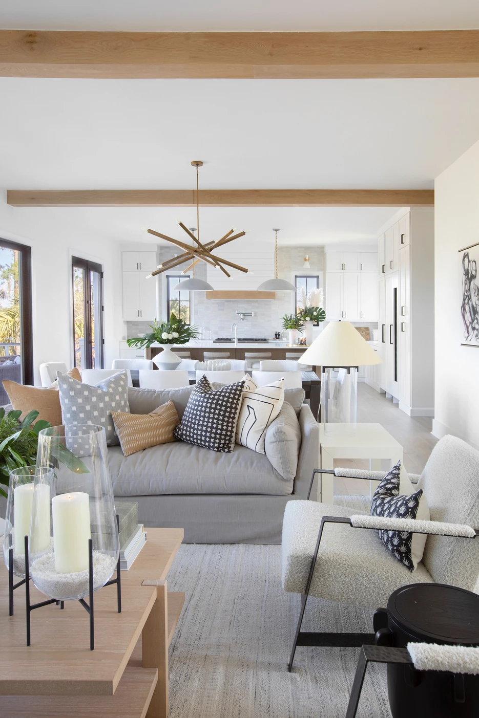
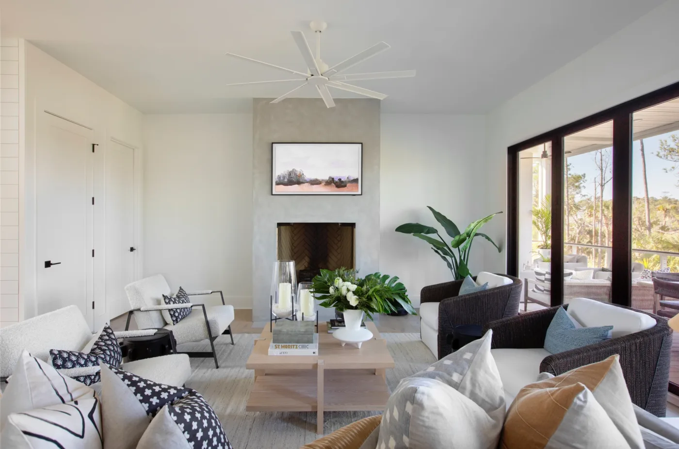
For the living space, all inspiration was taken from this beautiful view. We decided to install a HUGE sliding collapsable door highlighting the pretty waterfront view. While seamlessly blending the indoor and outdoor entertainment areas. This client, I mentioned, has a big family and loves hosting visitors, so plenty of seating was a must. Again, using performance fabric on all the furniture makes any accidents stress-free. Tying the space together – with pillows and accessories brought in a pop of color and made this area cozy.
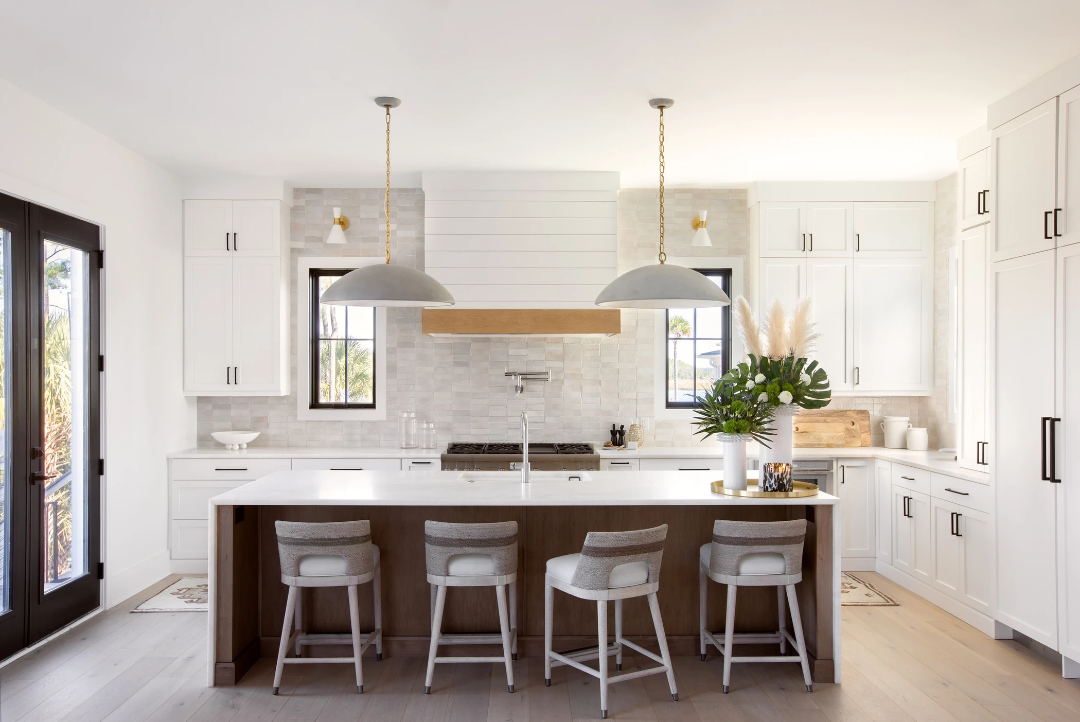
Tap To Shop Kitchen Essentials
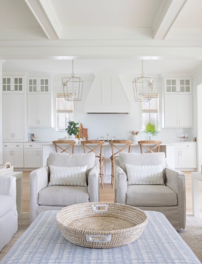
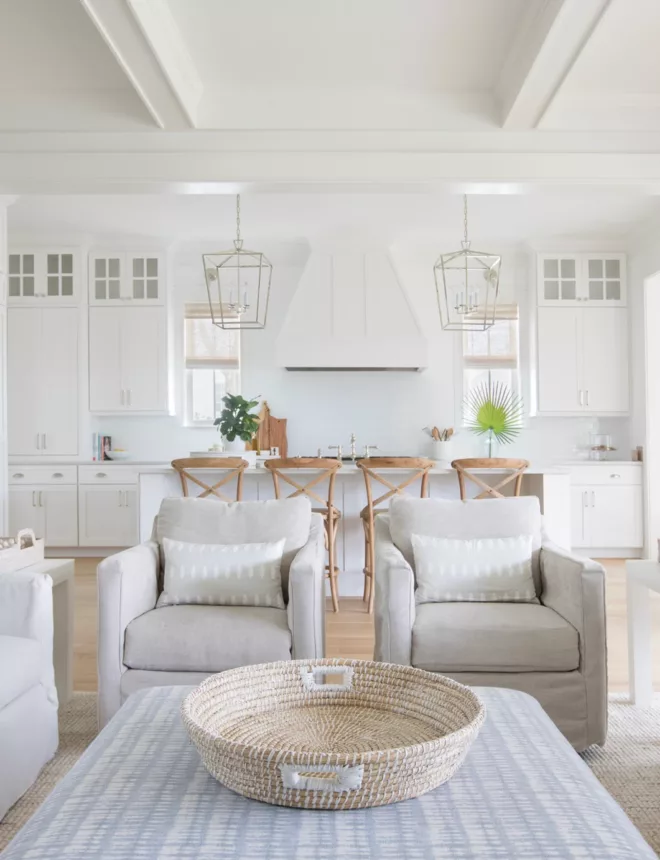
This gorgeous kitchen has so much to share! First, the mixed metals. I LOVE how this turned out. We incorporated polished chrome, brass, and black in the hardware and lighting fixtures.
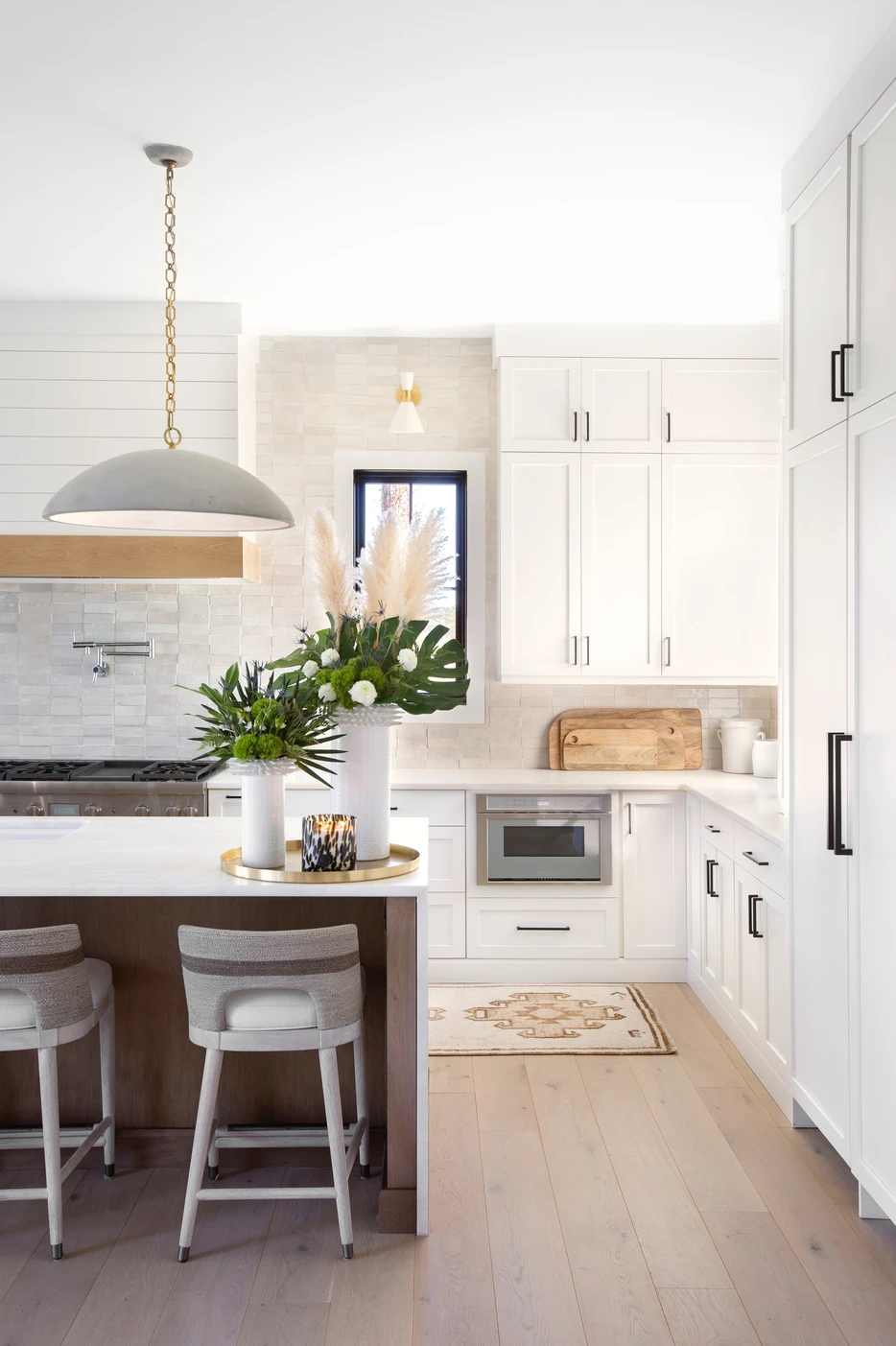
It is important to keep the color palette simple. We chose white cabinetry wrapped around the room, white oak cabinetry on the island, and simple classic pieces. Second, Marble countertops are my number one. Marble has been around forever- it is the gold standard. With so many man-made options on the market, families are afraid to put a marble counter in the kitchen. Marble is beautiful and timeless. As long as you do not let red wine or citrus sit on the countertop overnight, you’re set! Marble is so durable and easy to clean. Lastly, the Zellige tile backsplash- this tile provides contrast, warmth, and movement. I love the rectangular shape! This kitchen turned out so beautifully. I hope you love it as much as I do.
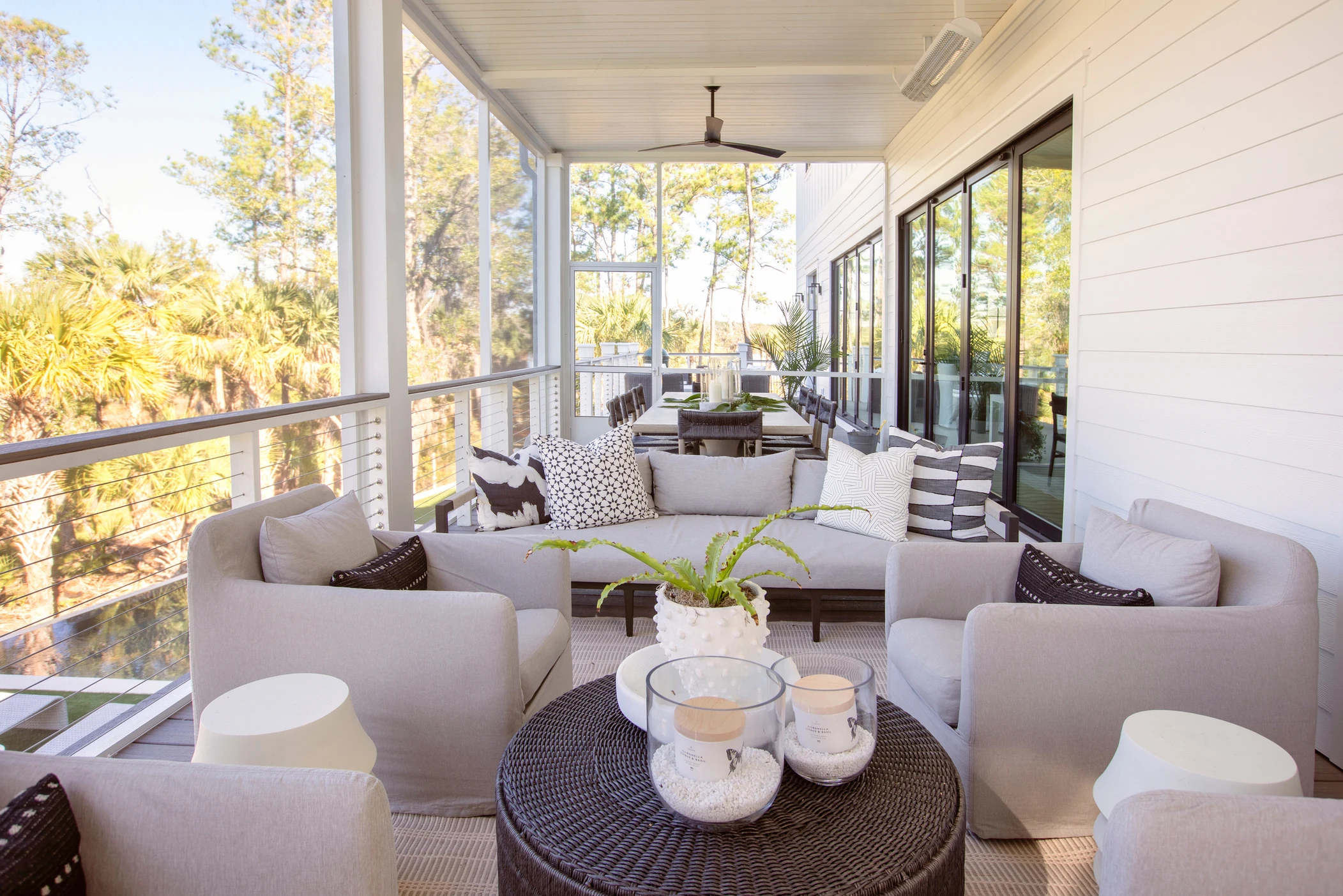
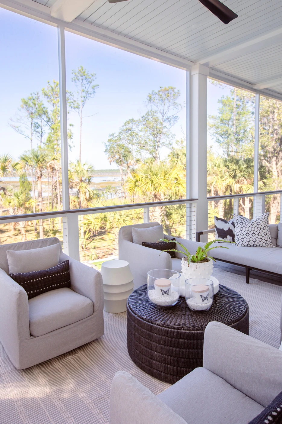
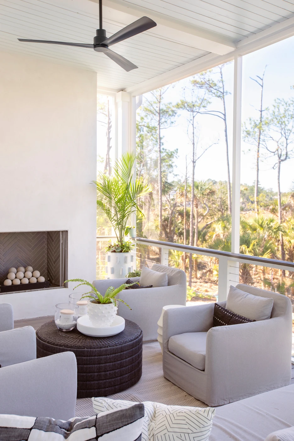
When selecting furniture and finishes for a porch, you don’t have to go with pieces that scream outdoors. There were not nearly as many options available on the market a couple of years ago, as there are now. I wanted to design a space where this family could host or hang out any day of the week. Filling the porch with plenty of seating, pretty outdoor candles, and faux greenery made the space feel like an extension of the indoors.
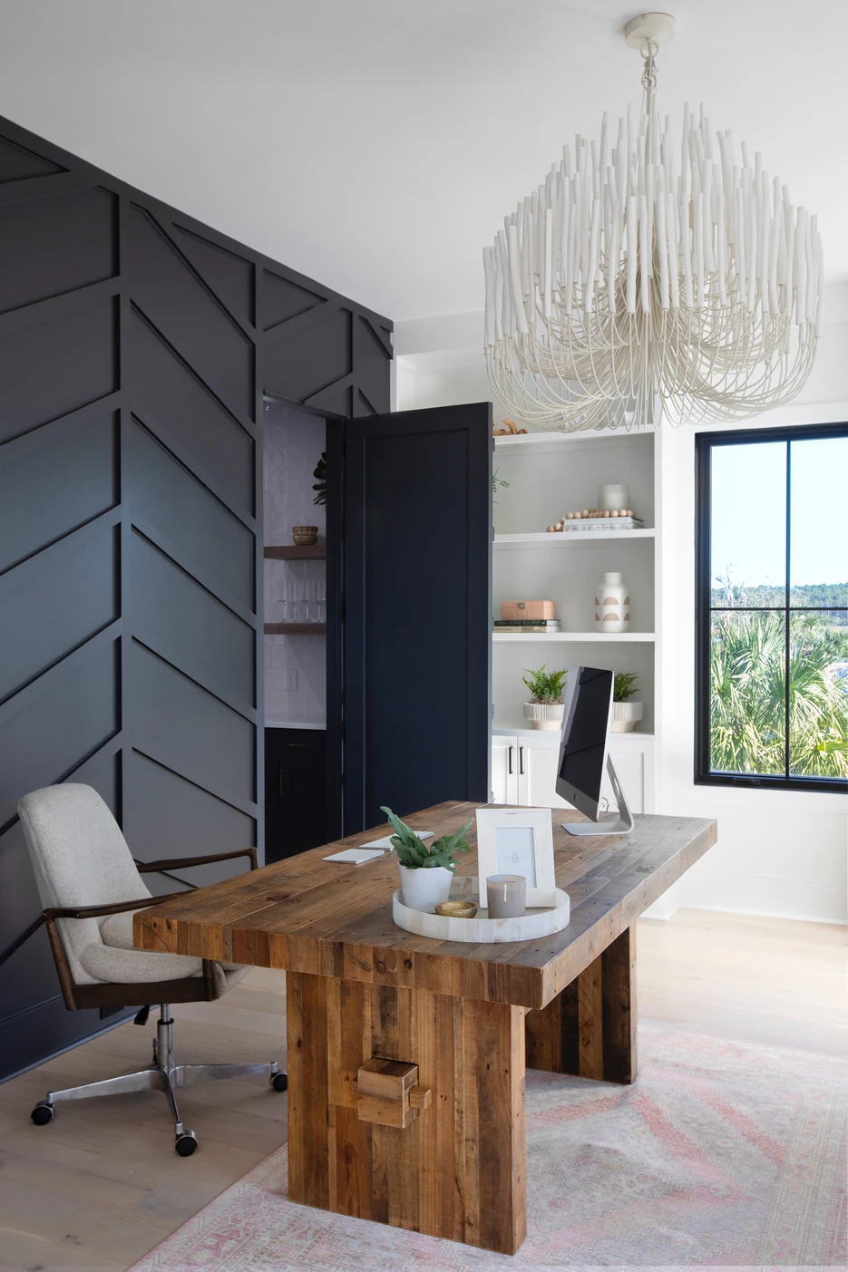
This client works from home. I wanted to create a relaxing, peaceful space for her to get work done. We went with a beautiful barn door since the office was right off the front entryway. I love the contrast it provides against the white walls. When entering the Study, you will notice how simple it is. Styling shelves and bringing in some furniture is all that we needed to do! My favorite thing about this office is the hidden door to the Butler’s Pantry. This secret door makes it easy to grab a drink or snack while working away!
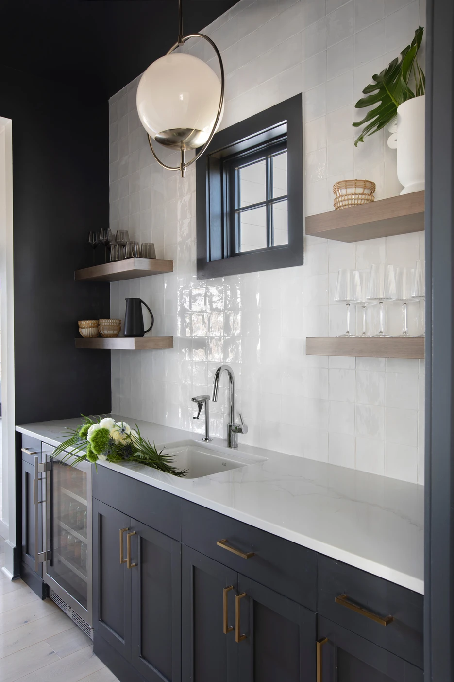
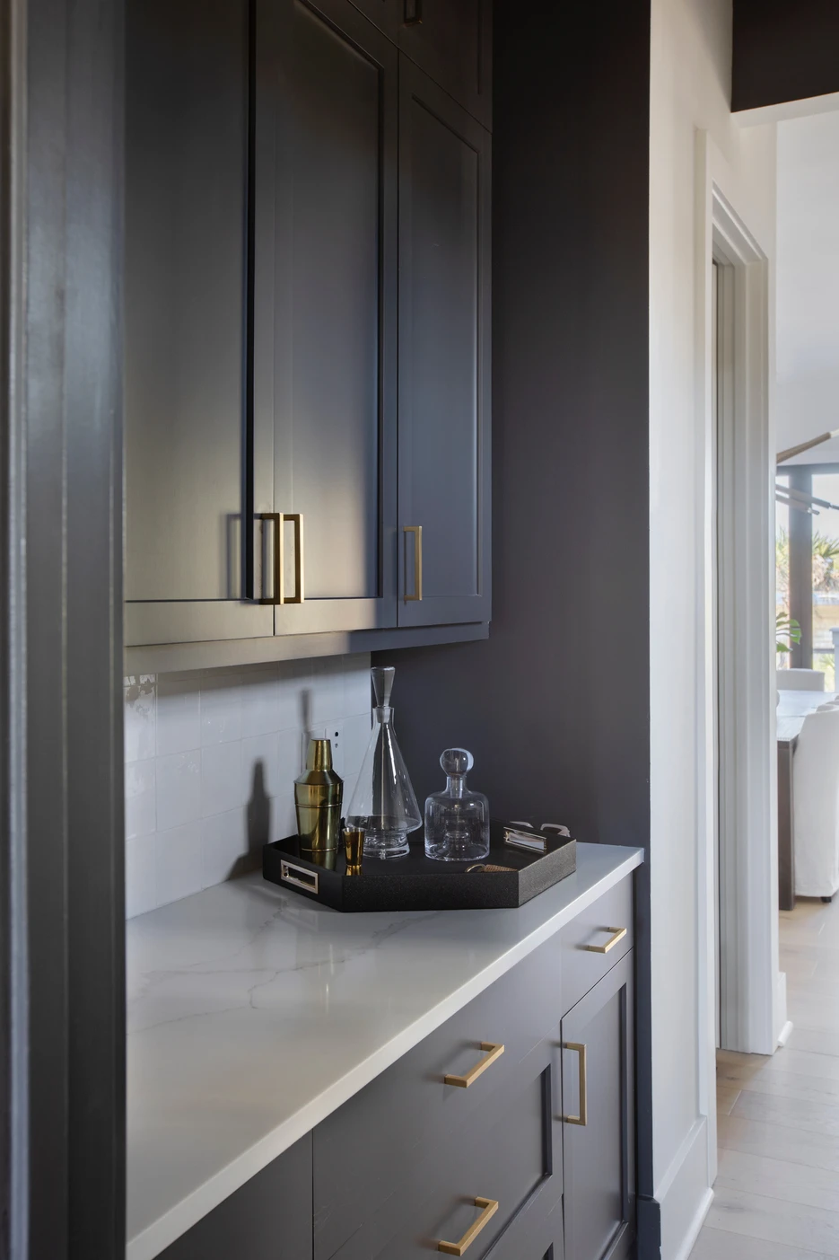
I wanted to create a moody space in the home that, as you can see, is majority white. To bring in a cool ambiance, we painted the walls, Cheating Heart by Benjamin Moore. I fell in love with all the pretty open shelves! We wanted to create a beautiful, functional space. First, sourcing pretty glassware was a must. I recommend glassware you love to use while keeping the color palette in mind. You will notice a mix of blacks, whites, and woven accents in the bar area. All design elements found throughout the room!
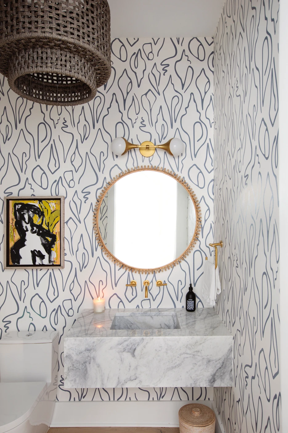
This room packs in all the personality while blending with the rest of the house’s aesthetic. I love to wallpaper smaller spaces! It adds depth and creates interest in a typically bland, boring room. We went with wallpaper by local textile artist Emily Daws. It turned out amazing! Brass hardware and accented mirror paired with a floating vanity give the Powder Room a Modern flare. I completed the space with my favorite bath accessories a french soap, candle, art, and basket.
