I’m asked this all the time, and honestly, I love it. The right paint color can completely transform a room, evoking the natural beauty of coastal surroundings while maintaining a calm, elegant, and livable space. Living and designing here in the Lowcountry, I’ve always been inspired by the colors around us — the driftwood grays, marsh greens, sun-bleached whites, and hazy coastal blues. I wanted more control over the exact shades I was using in my projects, so I partnered with Sherwin-Williams to create my own curated paint line — a collection of colors that feel calm, classic, and perfectly coastal. These are the hues I use again and again — whether I’m working on a historic home in Charleston or a new beach built with
a relaxed, lived-in vibe.
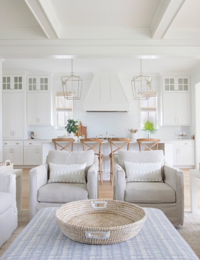
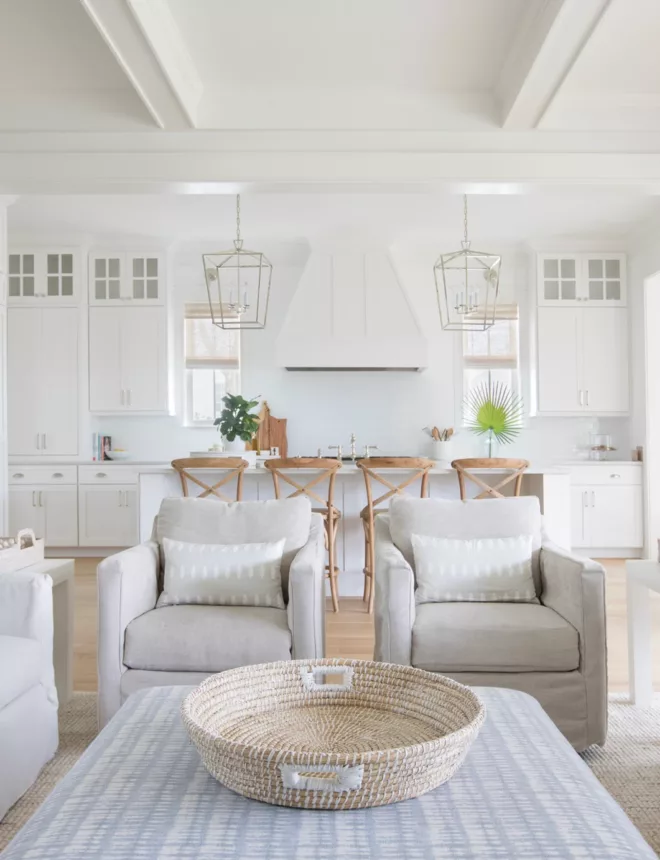
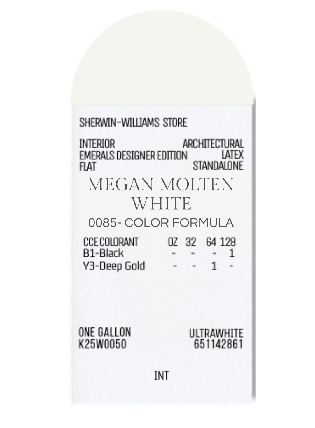
This white is warm without being yellow, and soft without being gray. It’s my favorite all-around interior white.
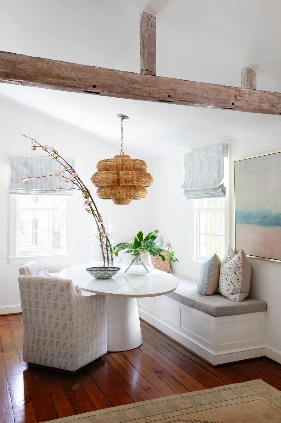
Designer tip: This is my go-to for creating that bright, airy Lowcountry light, especially in homes with lots of natural light.
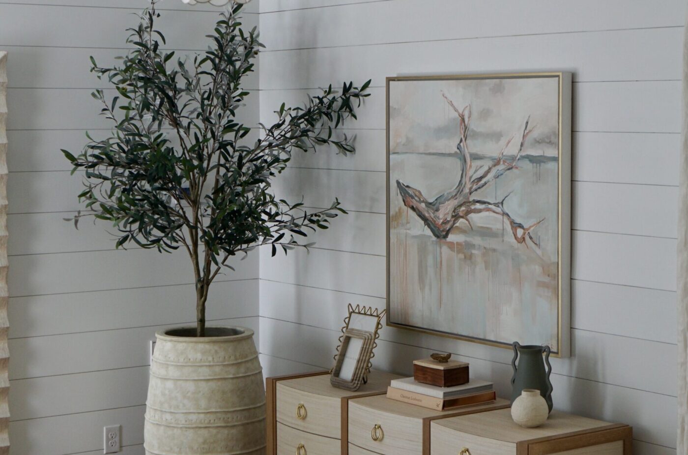
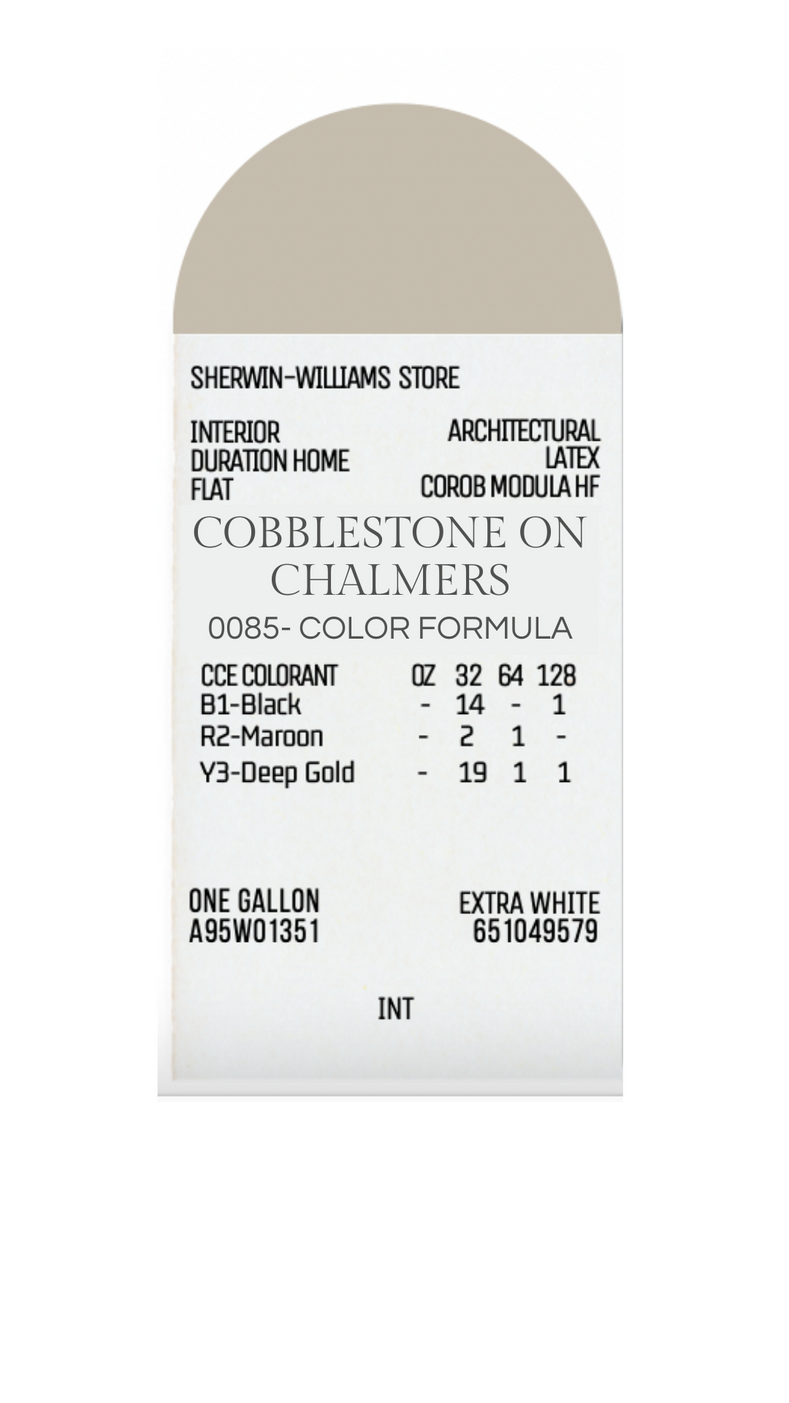
A subtle grey with just the right amount of warmth, Pale Oak brings quiet sophistication to any space.
Designer tip: It pairs beautifully with natural linen and reclaimed wood for a refined Southern look.
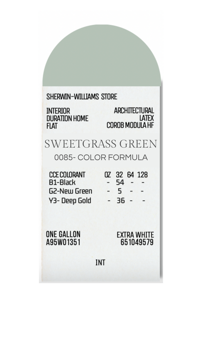
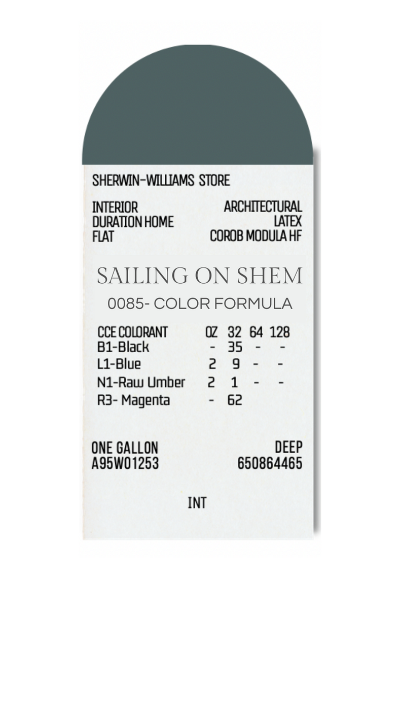
This soft, misty green has the perfect blend of gray and blue undertones. It instantly brings a sense of calm and feels like a breath of ocean air.
Designer tip: Pair with white trim and woven textures, such as rattan or seagrass, for a laid-back, beachy feel.
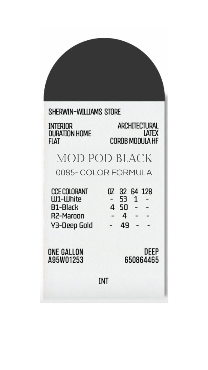
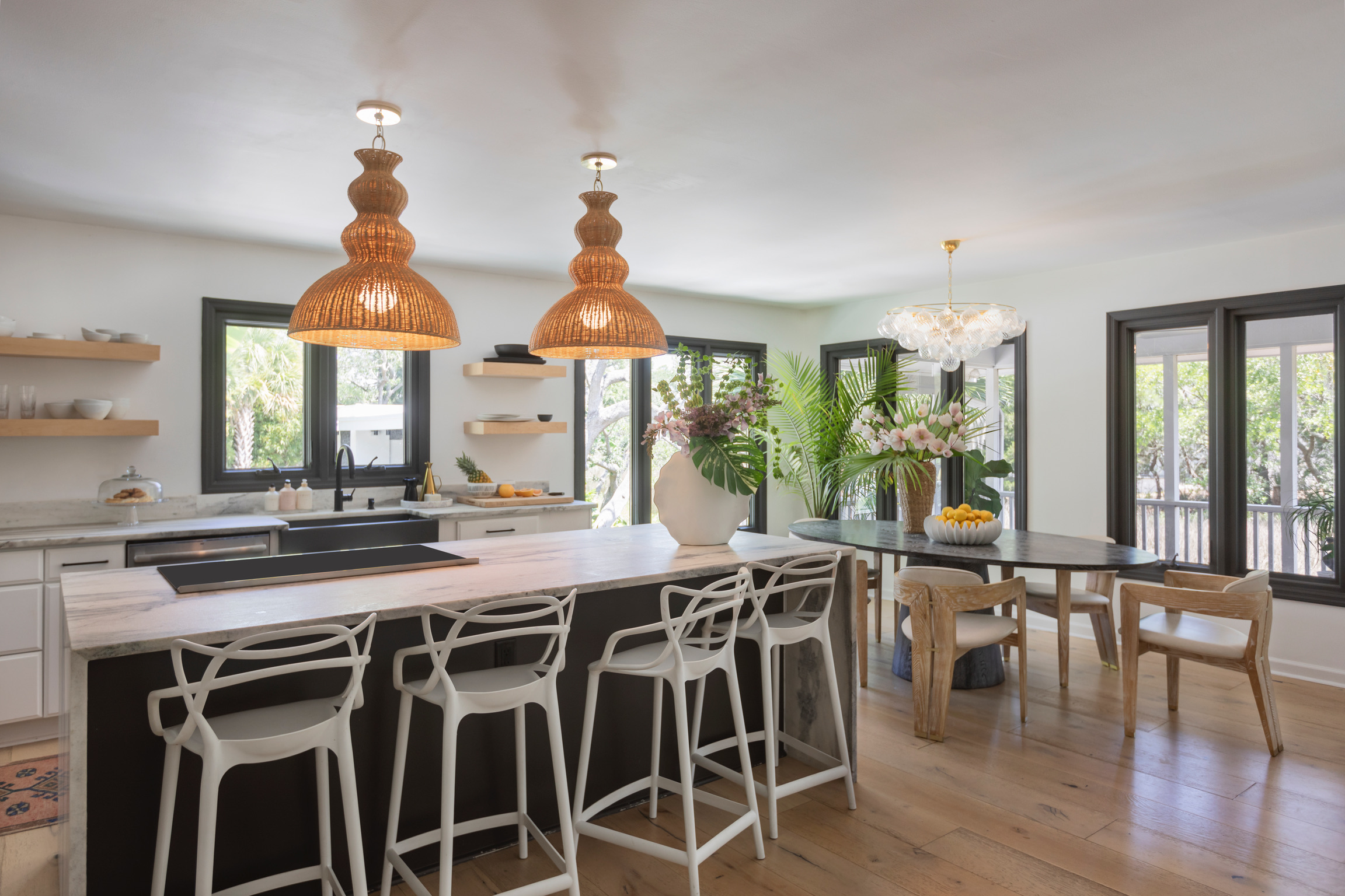
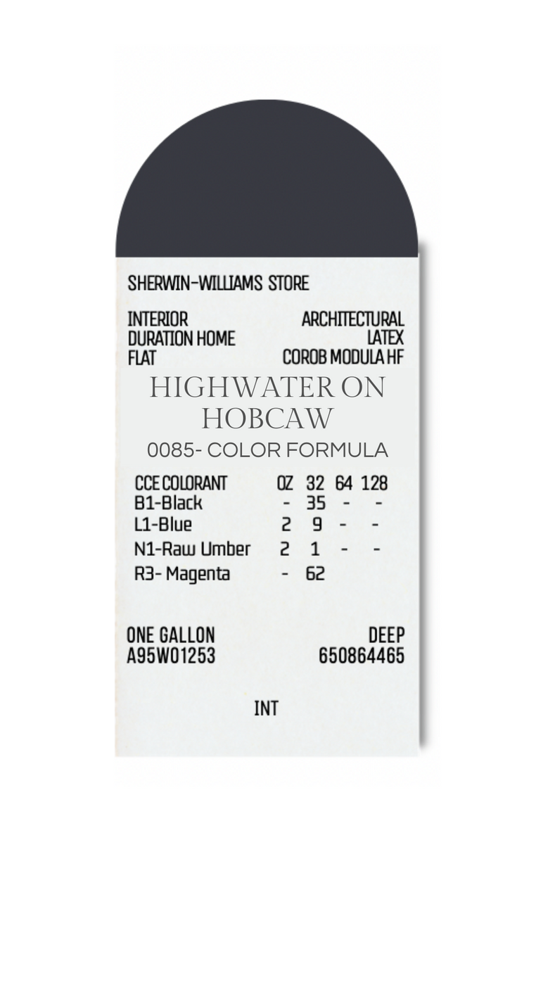
One of our favorite ways to create contrast in a coastal home is by using Mod Pod Black on the window trim. Whether inside or out, this deep, inky shade adds a modern edge that feels both fresh and timeless. On the exterior, it frames the windows beautifully against lighter siding, while inside, it adds just the right amount of drama without overwhelming the space. It’s a bold detail that makes the whole home feel more custom and considered.
SW Colors of Historic Charleston – Icelandic –
This hue is perfect for those looking for a barely-there blue that instantly makes a room feel lighter and brighter. It has just enough pigment to be noticeable, but it still reads as a soft neutral in natural light.
Designer tip: Pair it with crisp white trim (like Sherwin-Williams Extra White) and natural woven textures for that breezy, effortless look.
SW Colors of Historic Charleston- Shrimp –
Okay — how fun is this color name? Shrimp is a warm, playful coral that somehow feels both preppy and totally timeless. It’s bold, but not overbearing. Just enough punch to make a space pop.
Designer tip: Keep the rest of the palette soft and sandy — think warm whites, natural woods, and brass fixtures.
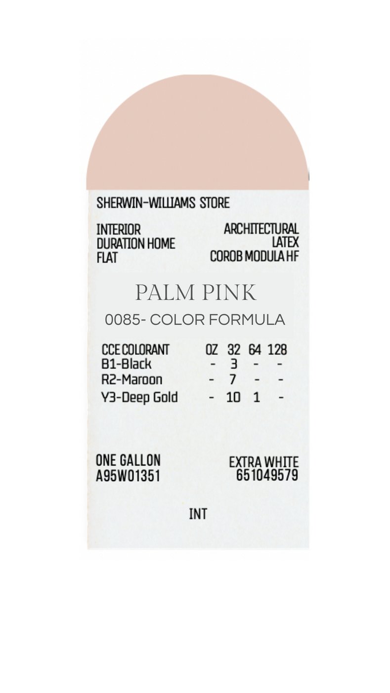
If you know me, you know I love using pink in my projects. Palm Pink is a sun-washed blush with warm undertones — soft enough to act as a neutral, but still full of charm.
Designer tip: Layer it with creamy whites, natural linens, and maybe a touch of wicker.
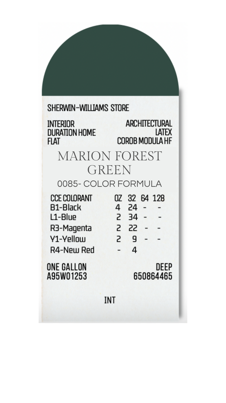
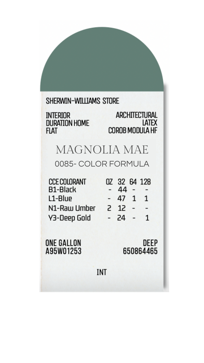
Two of my favorite new paint colors—Forest Green Marion and Magnolia Mae—are named after my daughters, who inspire me every single day. My love for the Lowcountry is deeply tied to my life with them—exploring Charleston’s historic streets, taking in the beauty of the marshes, and soaking up the natural charm that surrounds us. These colors are my way of bottling up that feeling.
Whether you’re drawn to soft and airy tones or something bold and moody, these hues can be interpreted in so many beautiful ways. They’re not just for coastal homes—they’re for anyone who feels inspired by nature, history, and a sense of place.
You can shop all my favorite picks at meganmoltenshop.com, or if you’re dreaming up something custom, submit a design inquiry [here]—I’d love to work together.