This is one of the most common questions I get from my Instagram followers and clients. They usually tell me they are having trouble figuring out how to mix and match their lighting in an open floor plan layout. I understand this can be tricky, especially when all of the lighting is visible all at the same time. The most important thing is to maintain cohesion and balance throughout the space.
This brings me to my first tip: have the lighting all tell the same story. Think about your style and what it says about your home. Is your style modern, classic, funky, feminine, bohemian, or something else completely unique to you? Once you define your style, next find some inspiration photos. I like to use Pinterest to pull inspiration photos and always recommend this platform to clients. You can search specifically what you’re looking for like “modern coastal lighting.” In fact, I always require my clients to send photos before we even begin work on a project! Start putting together all of the lighting you love on one page (just copy and paste the photos) so you can see them side by side. I use Keynote on my Mac to do this but any program would work, even just a simple Word document.
Next, ask yourself some questions around these photos and your inspiration. For example, how do your kitchen pendants look next to the eat in kitchen light you chose? I’m a very visual person so I need to see everything together in one place. It always helps my team and I create more cohesion in our designs!
My next tip is to pick your metals. I suggest sticking to two metals, at the most. My favorite combos are brass and black or chrome and black. You can always mix in something beaded or woven in there as well and those may not have a metal accent to them. If you’re adding a glass fixture, make sure the color of the metal that is exposed coordinates with your other metals in your home and on your other light fixtures.
Ask yourself what color are your drapery rods, your door hardware, the pulls on your kitchen cabinets? Those are the types of things you want to be thinking about when deciding which metals to use for your lights.
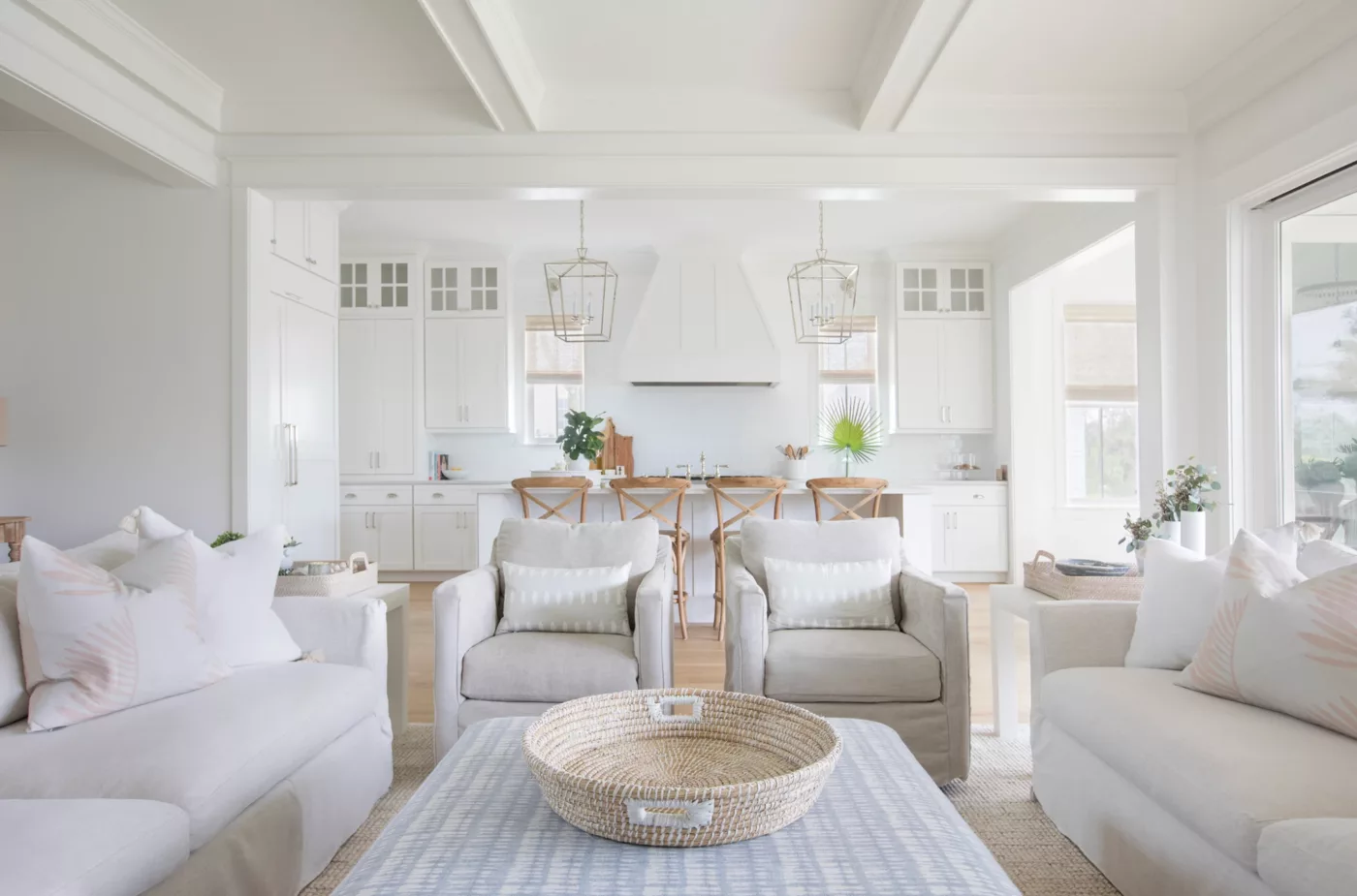
My last tip is to consider the shapes and styles you want. You need to mix and match so the lighting appears more collected, otherwise it can look predictable and boring. For example, you wouldn’t put lanterns over your kitchen island and then another lantern over your eat in kitchen table. You also wouldn’t put glass pendants over your kitchen island and then a globe glass chandelier over your eat in kitchen table. Catch my drift here? It’s just too similar and expected.
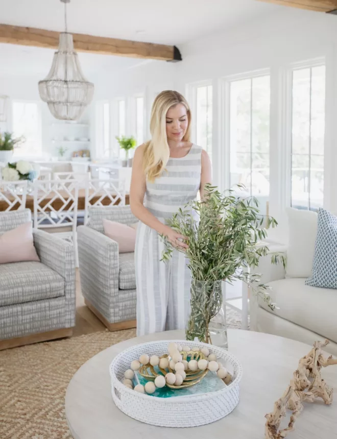
All in all, my biggest piece of advice is to mix it up! Mix those lanterns with a beaded chandelier and the glass pendants with a woven one. That creates more balance and variety in your space, which will create results that are appealing to the eye.
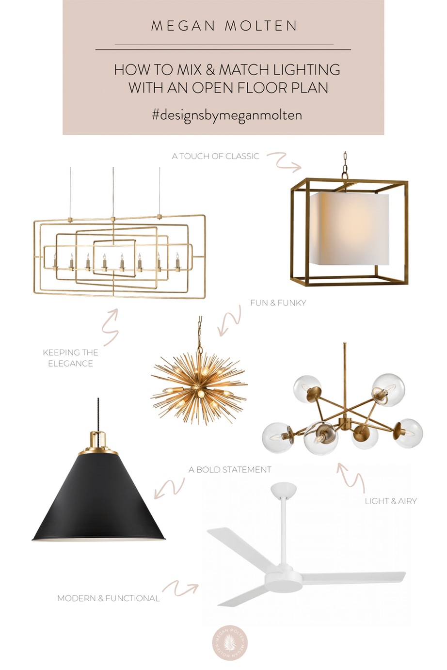
I’ve rounded up some examples of what we have done in client’s spaces to inspire you for your own home. We’ve also put together this handy dandy little guide to inspire you when choosing your lighting for your next project!
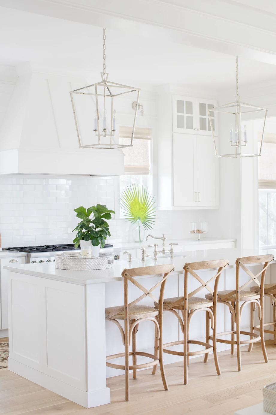
Daniel Island Project:
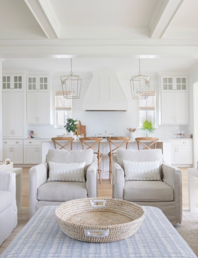
Here we mixed chrome lanterns in the kitchen, an oversized white ceiling fan (not pictured, see portfolio) in the living room and a white beaded chandelier in the breakfast nook.
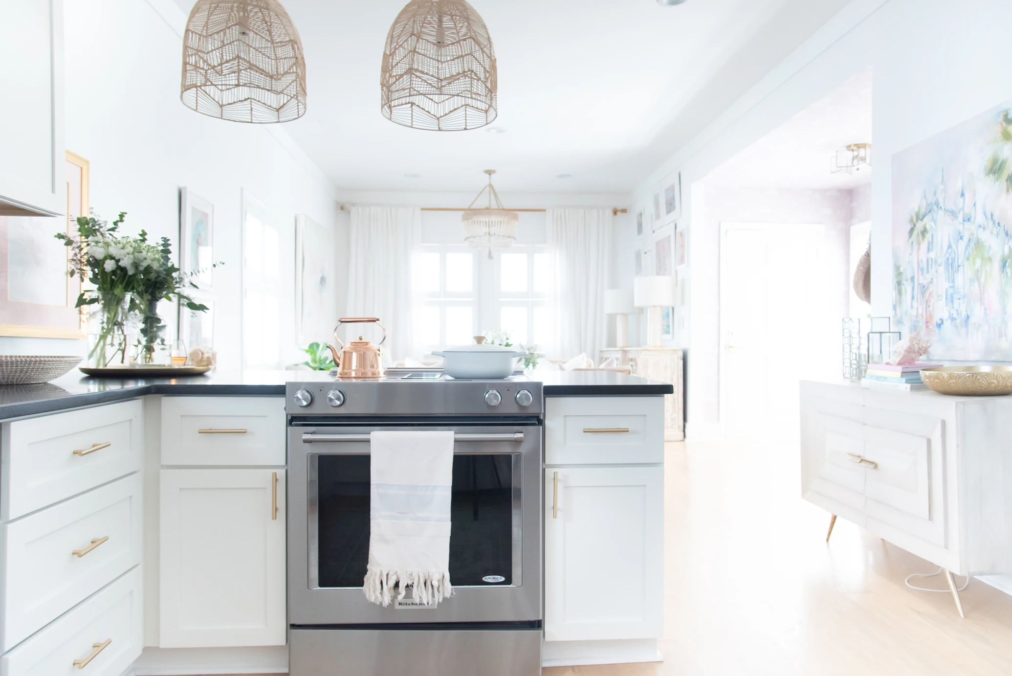
Megan Ann McFarland Style & Design Studio:
Here we used woven pendants in the kitchen, a white and blush beaded chandelier in the living room and a brass and glass flush mount for the entry.
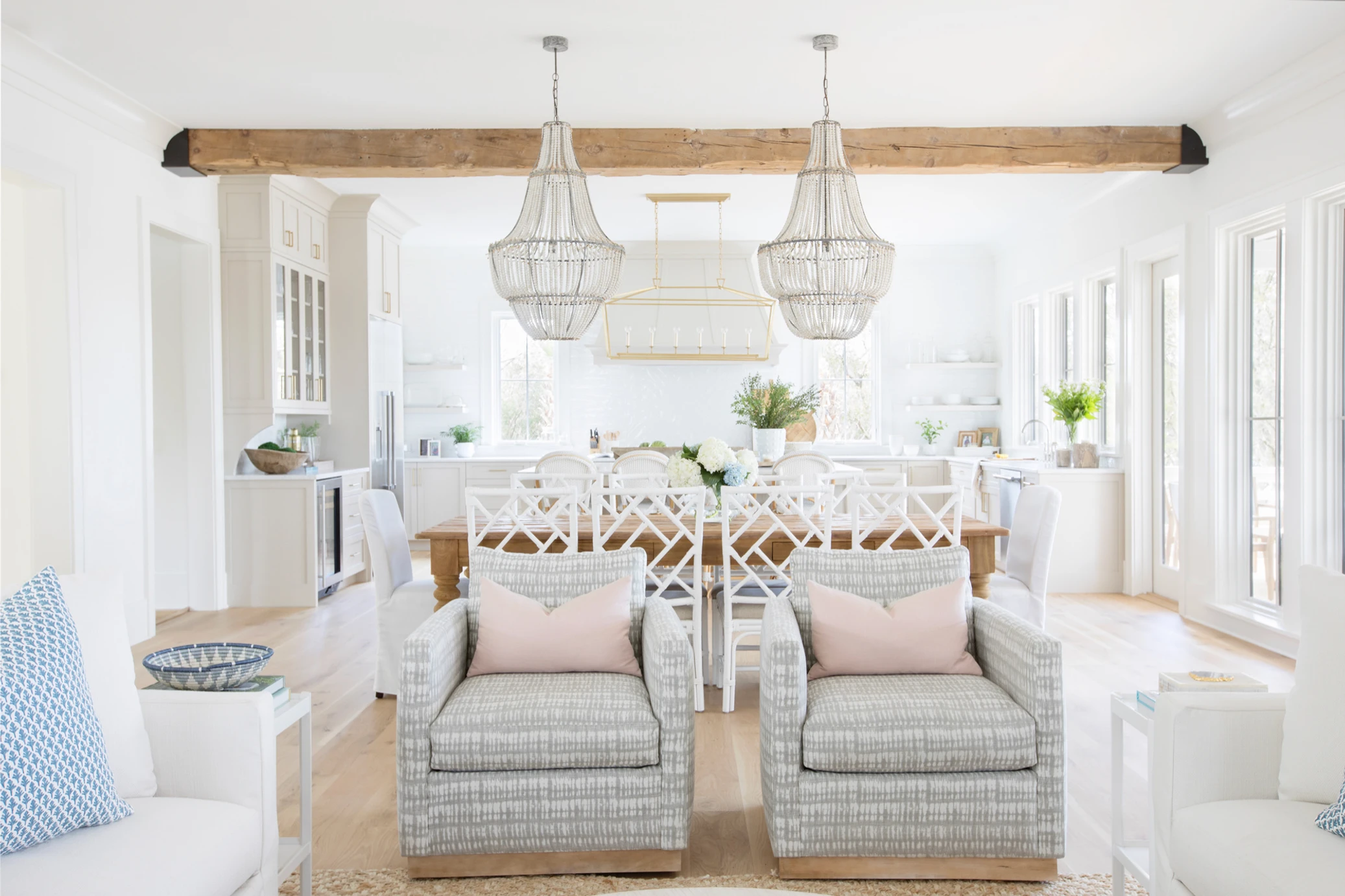
Freeman’s Point Project:
In this project, we combined a large brass lantern over the island, double white wash wood beaded chandeliers over the dining table and an oversized white ceiling fan in the living room.
Park West Project:
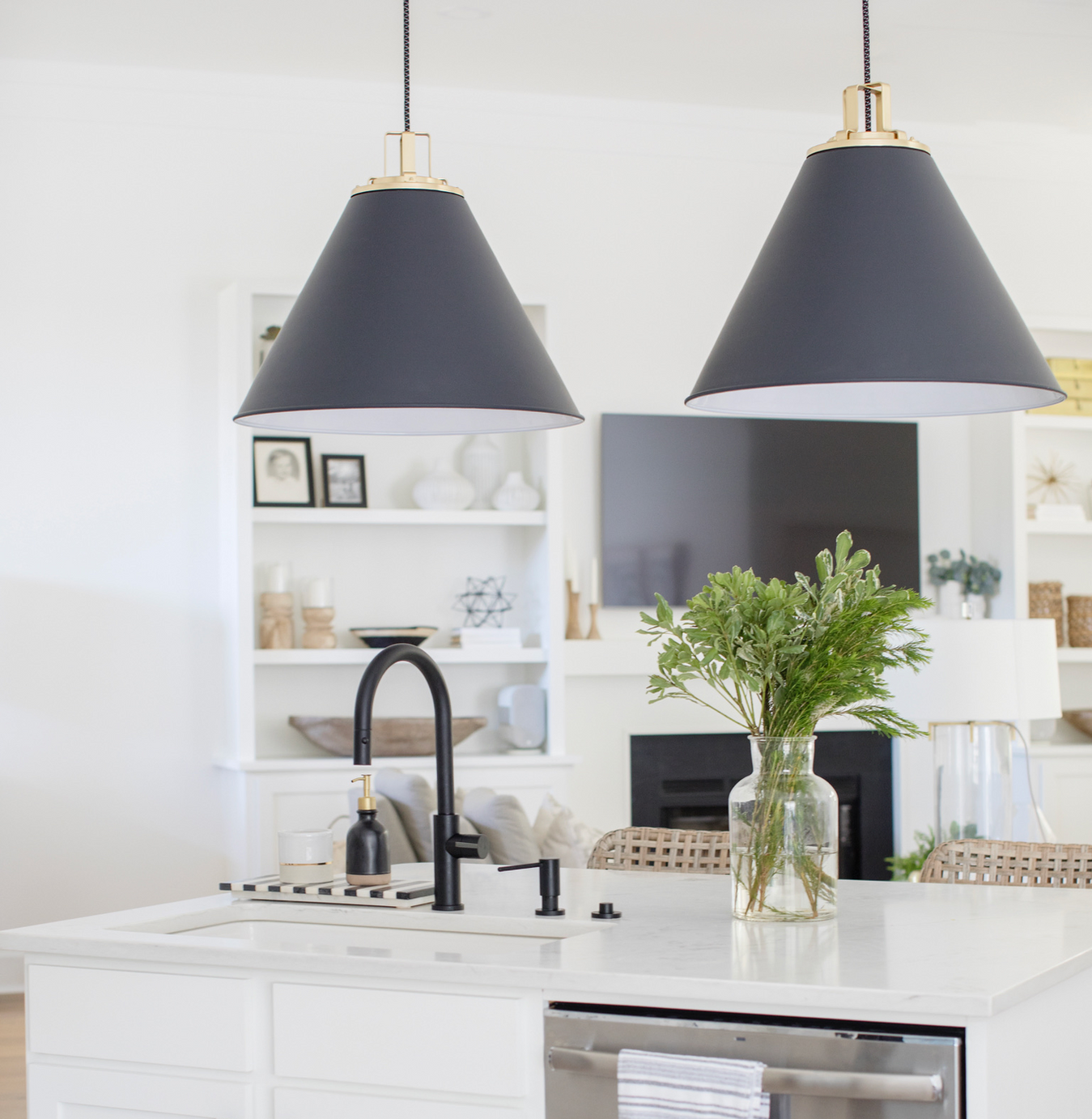
In this project, we combined brass, glass and black to keep the space very monochromatic and modern. We hung two large oversized black pendants in the kitchen, a glass and brass globe chandelier in the eat in kitchen, a fun sputnik brass chandelier in the laundry room (not pictured, see portfolio), a brass and linen shade pendant in the entry, an oversized white ceiling fan in the living room (not pictured, see portfolio) and a large linear brass chandelier over the dining room table.
As you can see, the right lighting is truly a game changer to any space! I hope this blog post gives you some insight into our process and how you can capture the perfect essence of your home through your lighting! We’ll be sharing more on our Instagram feed as we grow our lighting shop, so keep checking back in for more updates!
xx,
Megan
