Today’s post is in response to my most asked question of all time on Instagram – what’s my favorite white paint color? It seems so simple, right? White is white, right? Wrong! There are so many different shades of white. I honestly had no idea until I started designing spaces and using white paint on almost all of my projects. There’s something about a crisp, bright backdrop that makes everything feel newer, cleaner and more modern. Check out these before and after photos to see what I mean…

White has kind of become my go to and signature color. I always like to start with white paint and then add in quality neutral pieces while adding in soft color via art, pillows rugs and accessories. Let’s just call it “The Megan Molten” aesthetic 🙂 I got a lot of feedback from ya’ll on Instagram this week when I asked what you guys would call my design style and the words I saw the most were clean, coastal, modern, light, airy and bright. All of these adjectives make me think of white. So let me give you a run down of my favorites:
Benjamin Moore Chantilly Lace
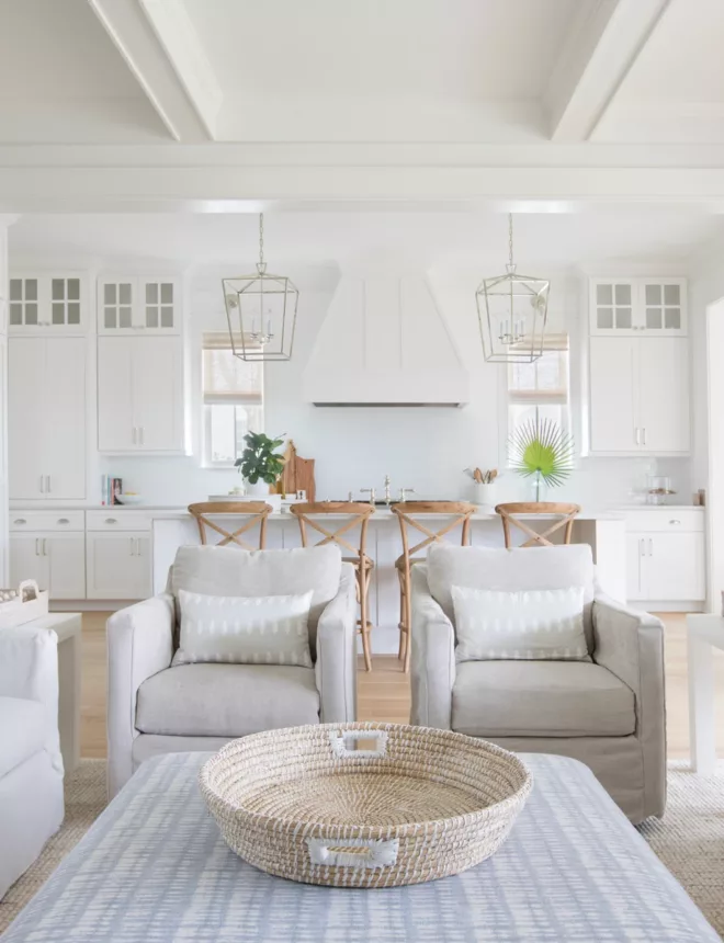
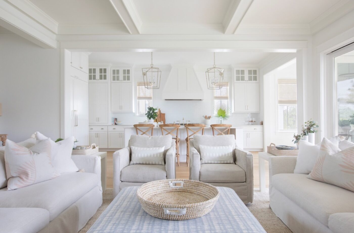
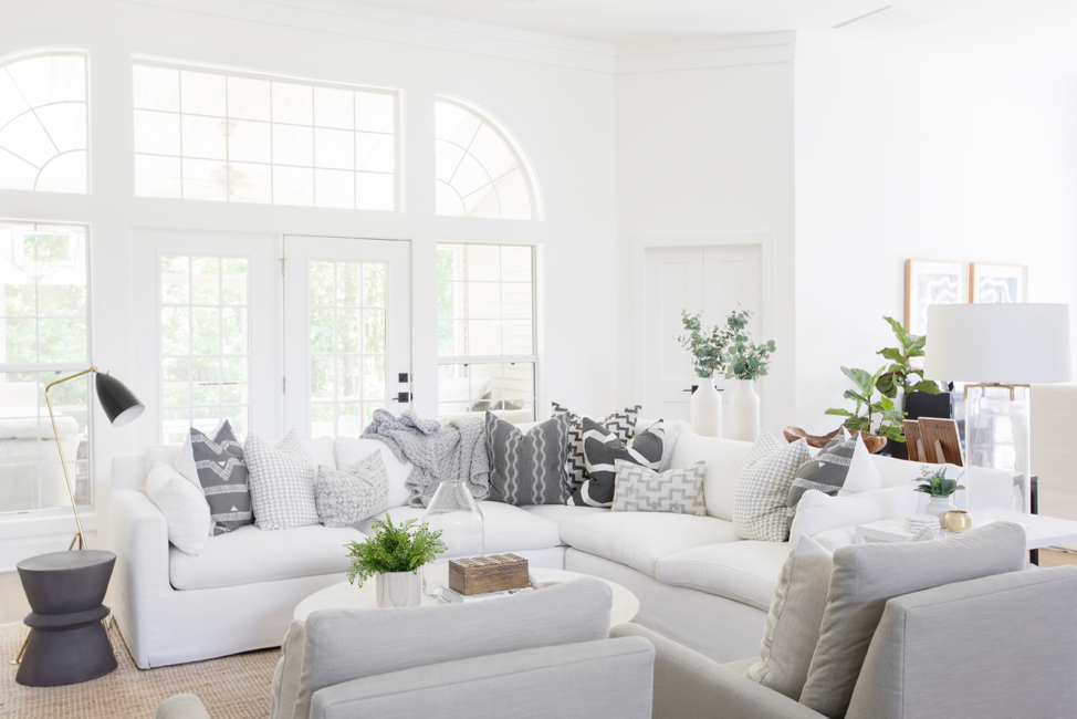
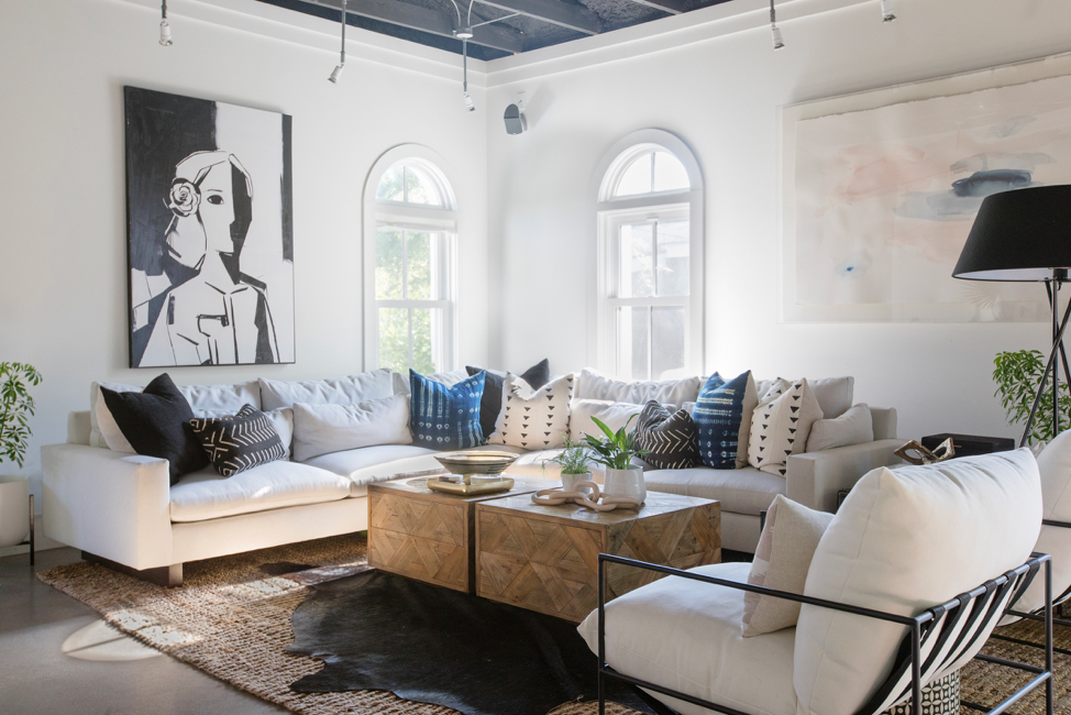
Gold Standard, GOAT (greatest of all time), Signature Color- THIS IS IT. Give me one color and I’m done. The most crisp, no undertone white you have ever seen. Some say it pulls a bit of a blue so maybe that’s why I love it so much! Blue is my second favorite color, after pink of course! I’ve painted both of my design studios this color as I love a clean work space, the majority of my client’s homes and now my husband and I are renovating a home and using this color. It’s just the best. I joke that Benjamin Moore should rename this color Megan Molten White. Am I right?
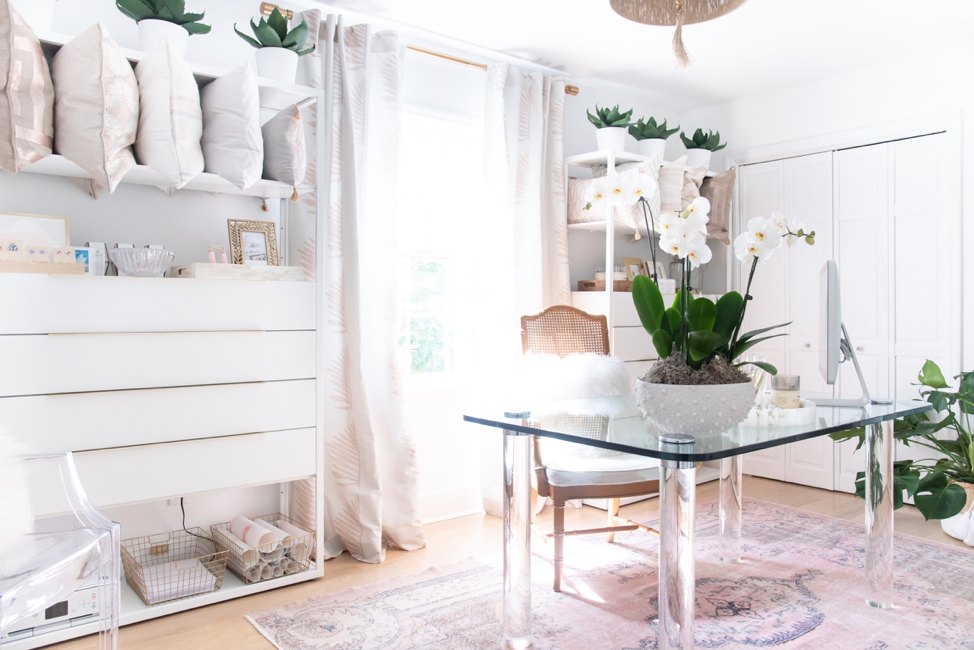
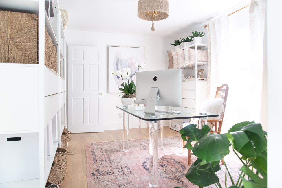
Chantilly Lace in the Megan Molten Design Studio:
Chantilly Lace in the Freeman Point Project:
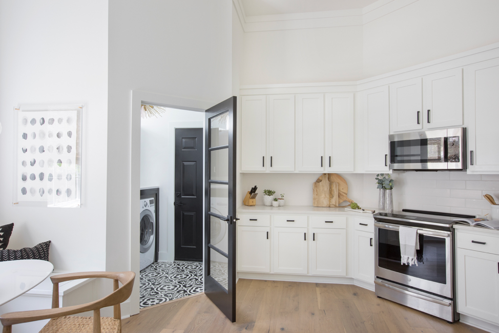
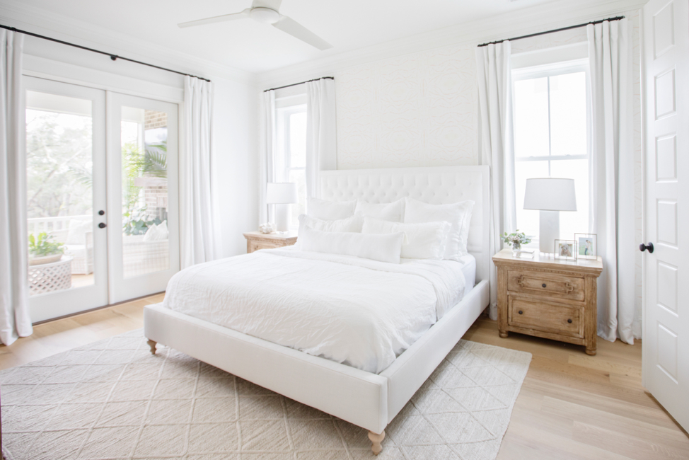
Benjamin Moore Super White
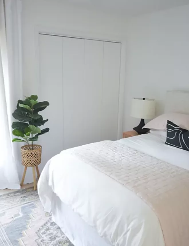
This is another good no undertone, bright white I learned about after moving into my now husband’s home. I call this Hugh’s Signature color! I think it pulls the tiniest bit of grey and looks so modern and clean. I truly love this shade so much and have come to use it in so many of our personal spaces!
Super White in my home:
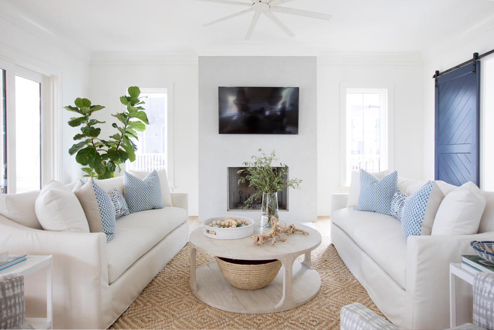
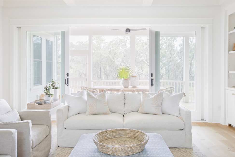
Sherwin Williams Pure White
This is a good white with the tiniest amount of warmth possible added to it. It’s a good option if you want a little more of a traditional look or something not as stark.
Pure White in the Daniel Island Project:
Here are a few of my other favorite white paints and finishes for ya’ll! I keep the same color consistent throughout my spaces on walls, ceilings, trim, and cabinets. If you’re wanting more contrast, go for a warmer white on the walls and a crisper white on the cabinets and trim. For example, Pure White on your walls and Super White on your cabinets and trim. I like my walls and ceilings in a flat finish and I use a satin (the most flat you can get without being a flat) on cabinets and trim for more durability. For extra durability on your flat walls, opt for a scrubbable. I just use a magic eraser and any little nicks or dirt comes right off!
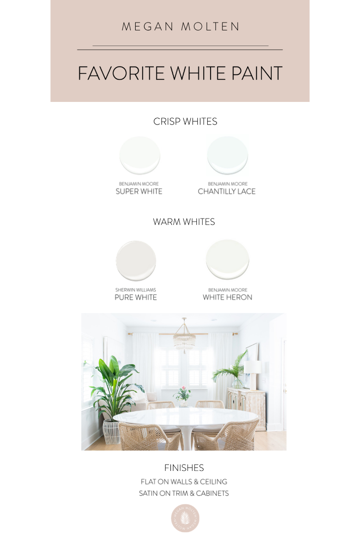
When in doubt, always try it out! Test large areas and look at it during the day and night as the color will change with different lighting. The light filled space from our Daniel Island Project is painted Pure White from top to bottom!
Hope this was helpful for ya’ll! We will be sharing progress as well as before and after photos from our new home the #moltenmodpod soon! For now, you can see all the updates on my Instagram highlights under “Mod Pod.”
xx,
Megan