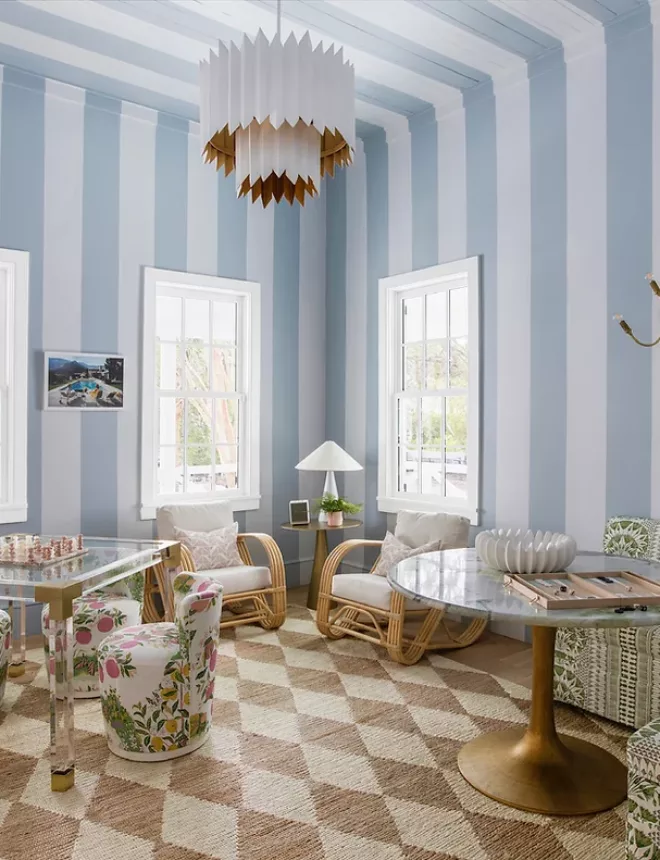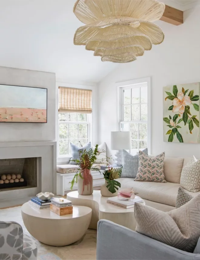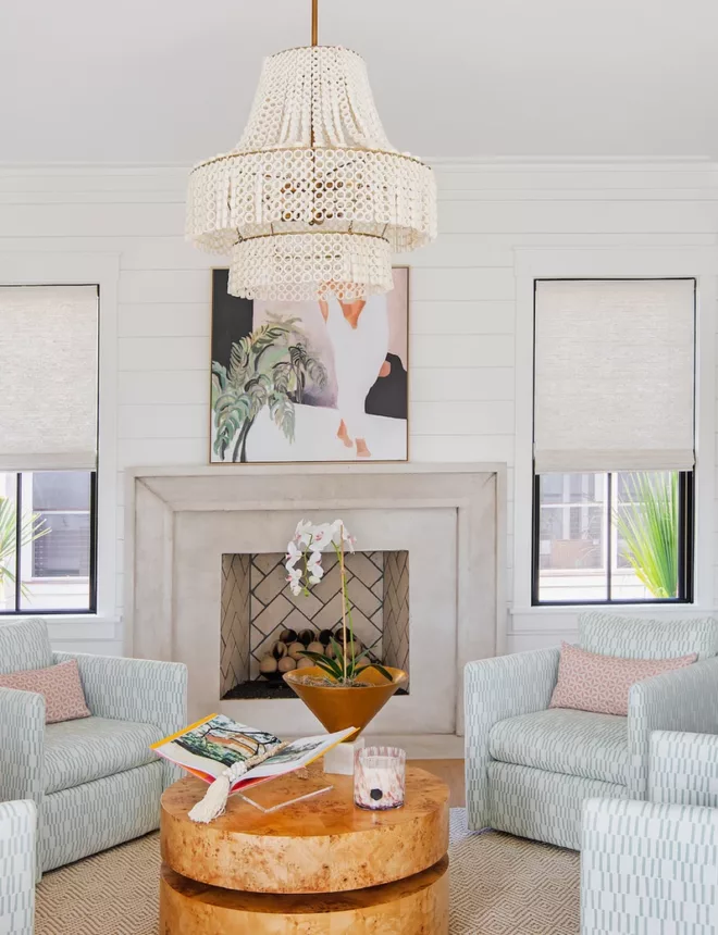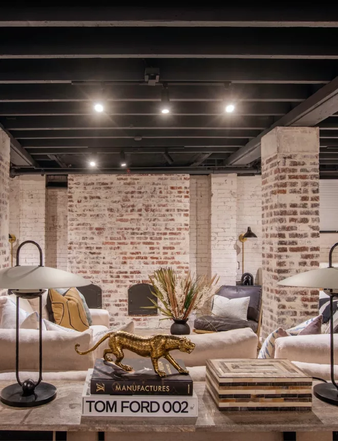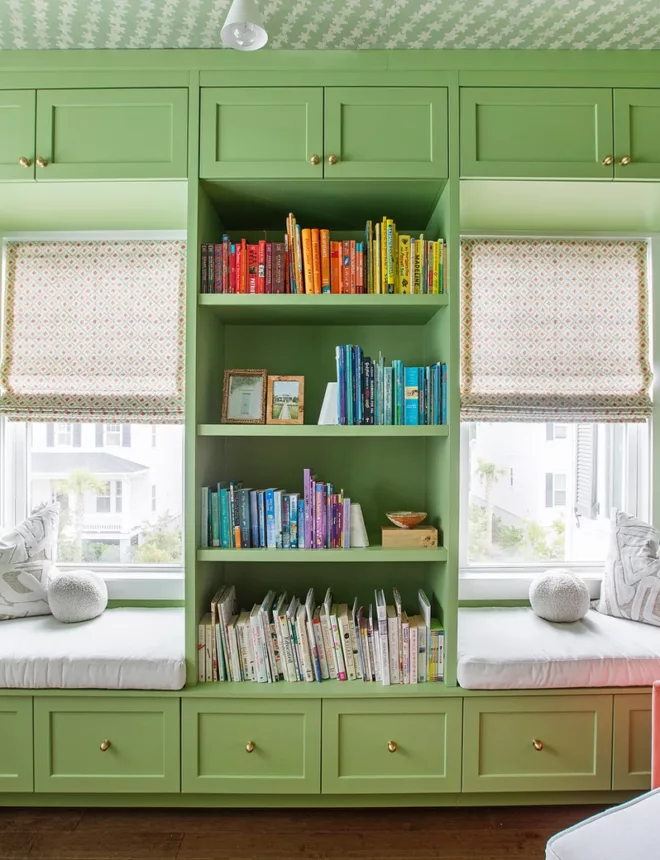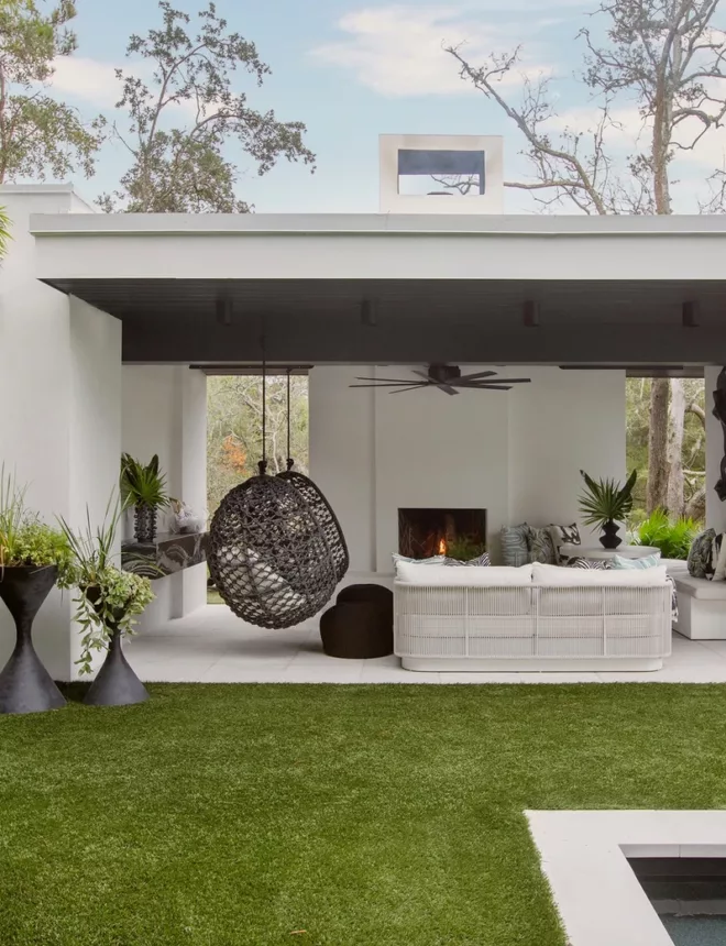
The Scotts Creek project was so much fun as we worked on many spaces throughout the home. Our clients are a young family who needed help bringing their space to life! We incorporated wallpaper, artwork, furnishings and decorative accessories to transform their house into a beautiful place to call home!
When working with design clients we first have an on-site consultation where we gather information such as what items will be staying in the space, what rooms we will work on and taking measurements. From there we create furniture plans to help plan how the space will best work.
Once we have decided the best layout for the room, we create presentation boards. These boards help our clients to visualize the selections and how they work together in the completed space. After all of the selections have been approved by the client, we make any adjustments and place orders.
During our initial consultation we photograph everything! This helps us not only with planning but showing how far the space has come. I love nothing more than taking a look back at before and after photos to see what a difference we have made to the space and overall look of the home.
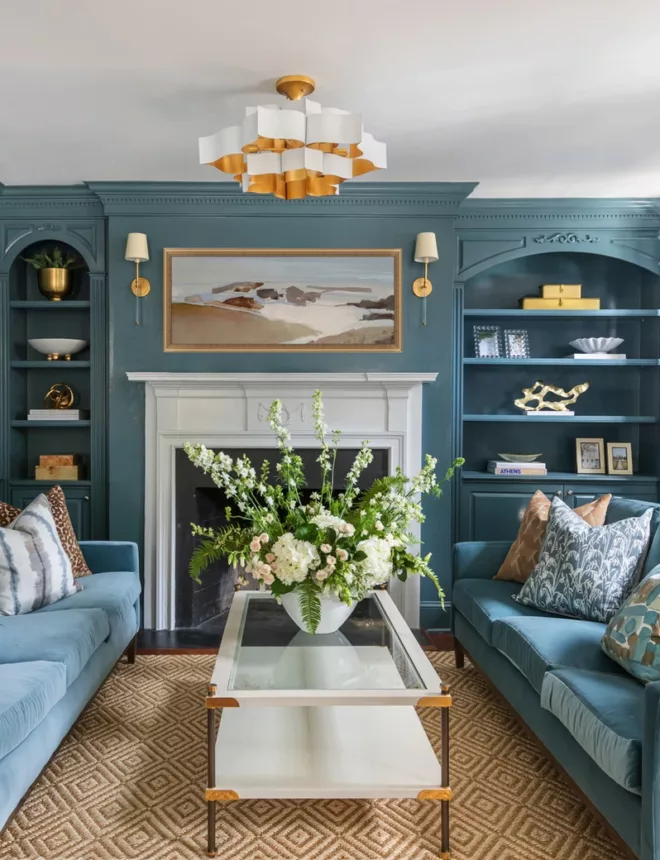
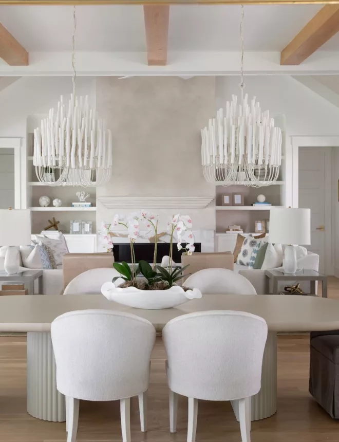
The Scotts Creek living room had existing items we decided to keep and work into the design such as the sofas, coffee table and chandelier. If our clients love a specific item or we feel something they have is simply in need of styling, we will incorporate it into the new design plan.
We added a vintage rug from the shop, pillows by Emily Daws Textiles, artwork from our shop by local artist, Danielle Cather Cohen as well as decorative accessories from the shop!
We also added gorgeous chairs in a beautiful blue antelope pattern. A fun pop of color is important in bringing style into a space.
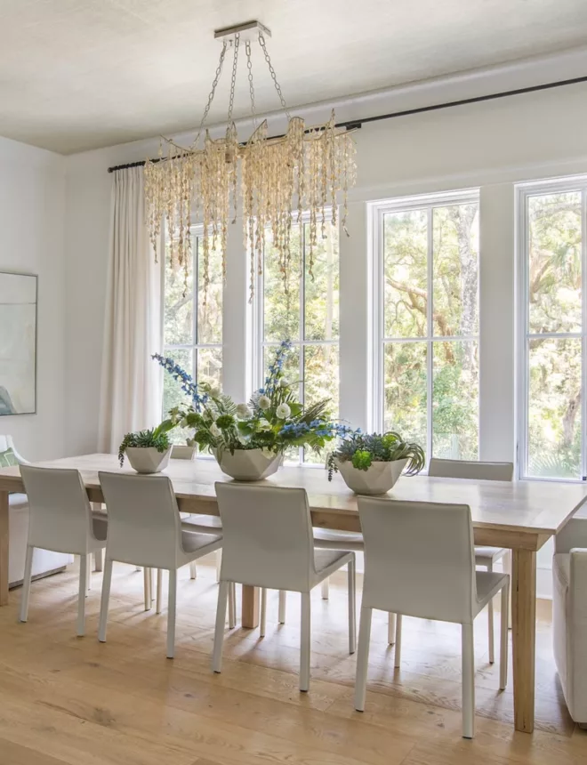
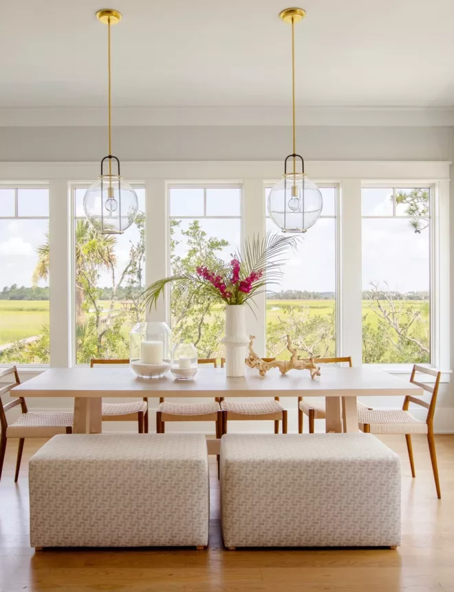
The living room leads into the open eat in kitchen. I absolutely love this space as there are tons of windows and natural light. We created a floor plan to help our clients envision where the furniture and chandeliers should be placed.
Our presentation boards show the selections for the table, chairs, chandeliers, artwork and a sideboard.
The before and afters show how small adjustments can modernize and brighten a space! I love how the new table and light fixtures completely change the look of the room.
We added a glass pyramid vase and dried palms as well as a woven bowl from the shop to finish the kitchen table. We added grey patterned planters, a twisted wood branch and marble frames to the sideboard to complete the look.
I had so much fun with the mudroom. I love that these clients were open to color and fun wallpaper! We took the mudroom from drab to fab with Jennifer Latimer wallpaper and artwork from the shop!
Moving upstairs ~ I am SO excited to share the master bedroom update! This gorgeous room needed some major love. We started by setting up a furniture plan to show the best layout for the bed, nightstands, rug, ottoman, dresser as well as the sitting area.
During our client presentations we show the clients materials and samples of the wallpaper, paint and rug and fabric options. We also show them how these selections work together in the presentation boards. It is a true visual of how the room will look once completed.
The before and after photos of the master show just how much the extra design elements help to bring a room together. We used a large neutral rug to define the space for the bed. In the sitting area we incorporated a white cowhide rug. We also used my favorite Marti Chests as side tables from the shop. I find using chests as nightstands creates extra storage space which is often useful for our clients. We added in decorative accessories, frames, planters and greenery to the nightstands.
I love the use of soft artwork in bedrooms. We chose Dreaming Chica by Windy O'Conner over the dresser as well as After the Storm 1 & 2 in the sitting area which are both available on the shop!
Another amazing space is the playroom! Our clients have two young children and creating a space for them was extremely important. The designated playroom has a huge wall which was screaming for a vibrant finishing. I had to create a statement wall with blue palm fron wallpaper by Thibaut.
We completed the space with a large fan, hanging chairs, and bean bag chairs. I also find storage is an important element when working with playrooms. Adding in shelving with baskets and large storage baskets helps to stow away toys and games when not in use.
Stay tuned as we continue to make more updates for this special family! More to come from the Scotts Creek project!
If you are interested in finding out more about our design packages, check out the services page on our website and welcome packet. Please fill out the design inquiry form to determine if we are a good fit for your next project!
xx,
Megan
Shop The Post